10 Year Challenge: how popular websites have changed
4 min read Jan 22, 2019
As the #10yearchallenge is making its way around the internet, I thought I would look at how some of the most visited websites on the internet have aged over the last 10 years.
Note: this post is best read on a computer or tablet.
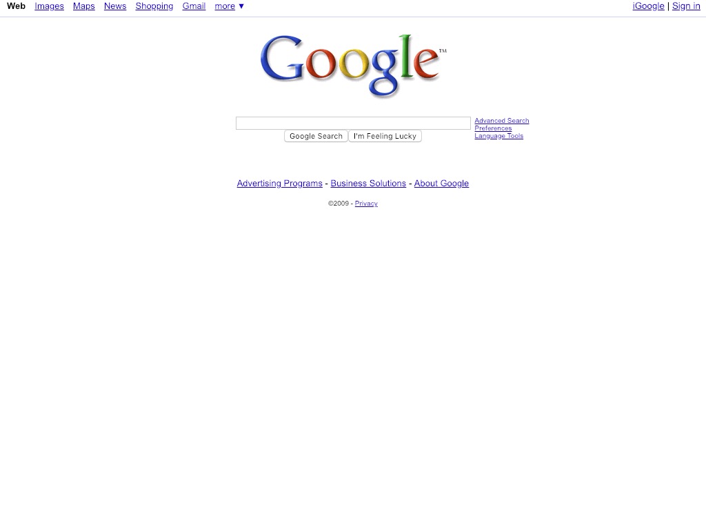
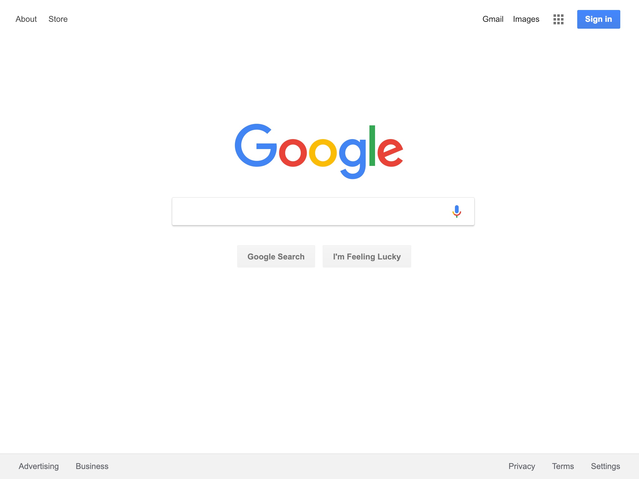
The most noticeable change in Google is its redesigned 2015 logo. 10 years ago, it still had the logo that remained unchanged from 1999 to 2010. Aside from that, the site has certainly become less visually cluttered and dare I say, more minimal.
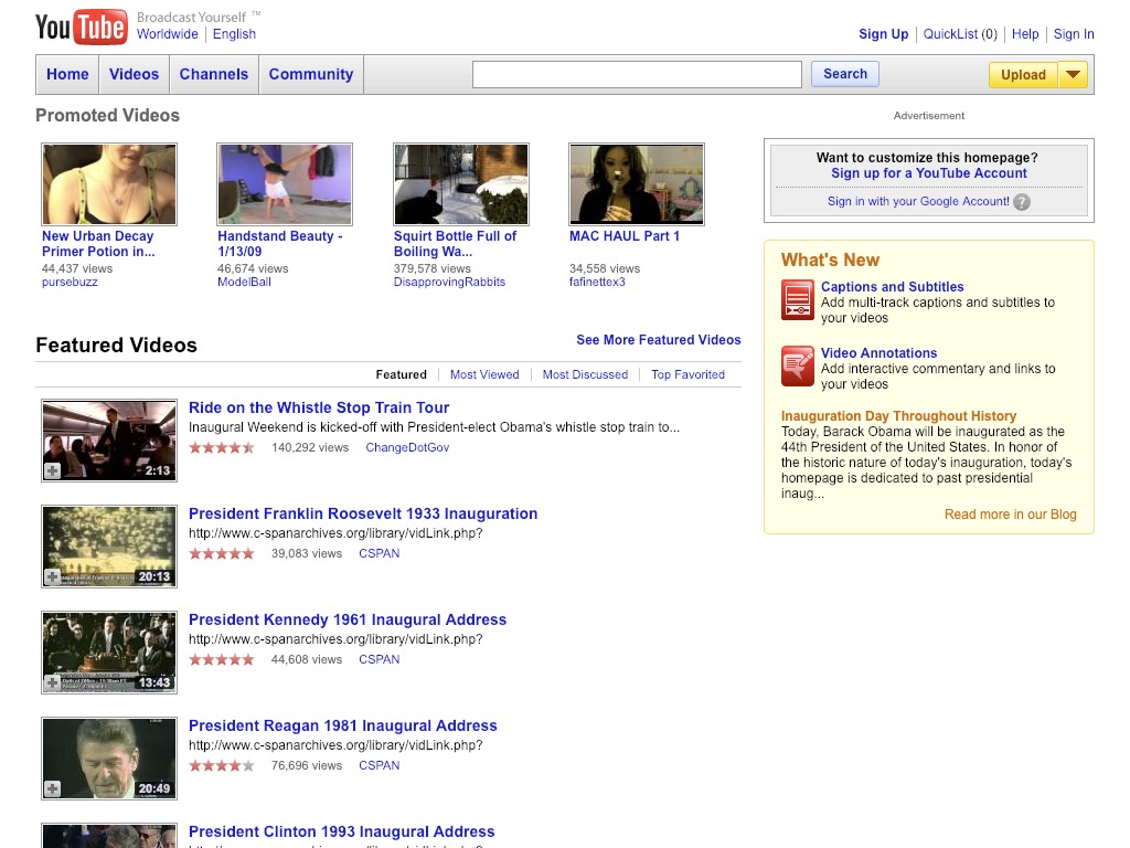
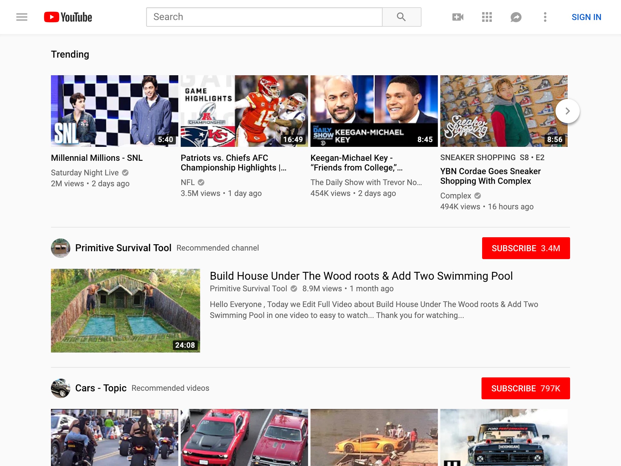
YouTube
10 years ago, YouTube was only 2 years into its life as a Google subsidiary. It has clearly undergone the flattening and simplification the rest of the web has experienced over the last decade.
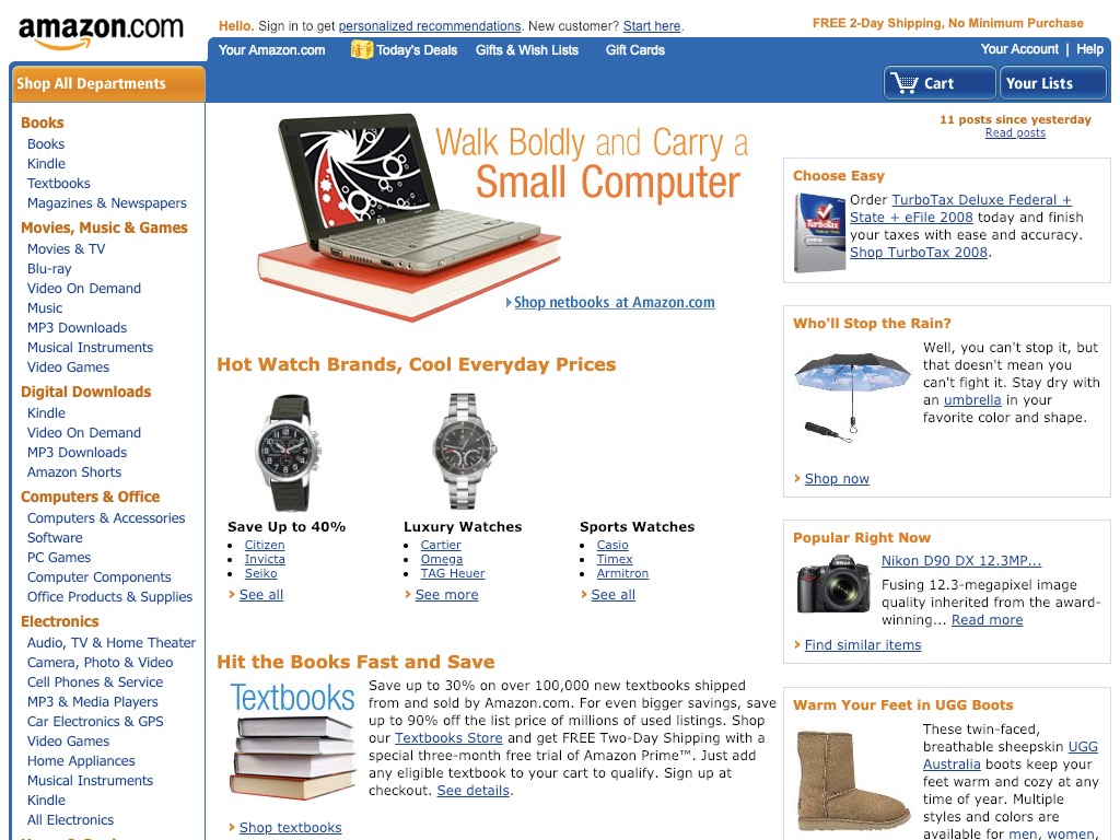
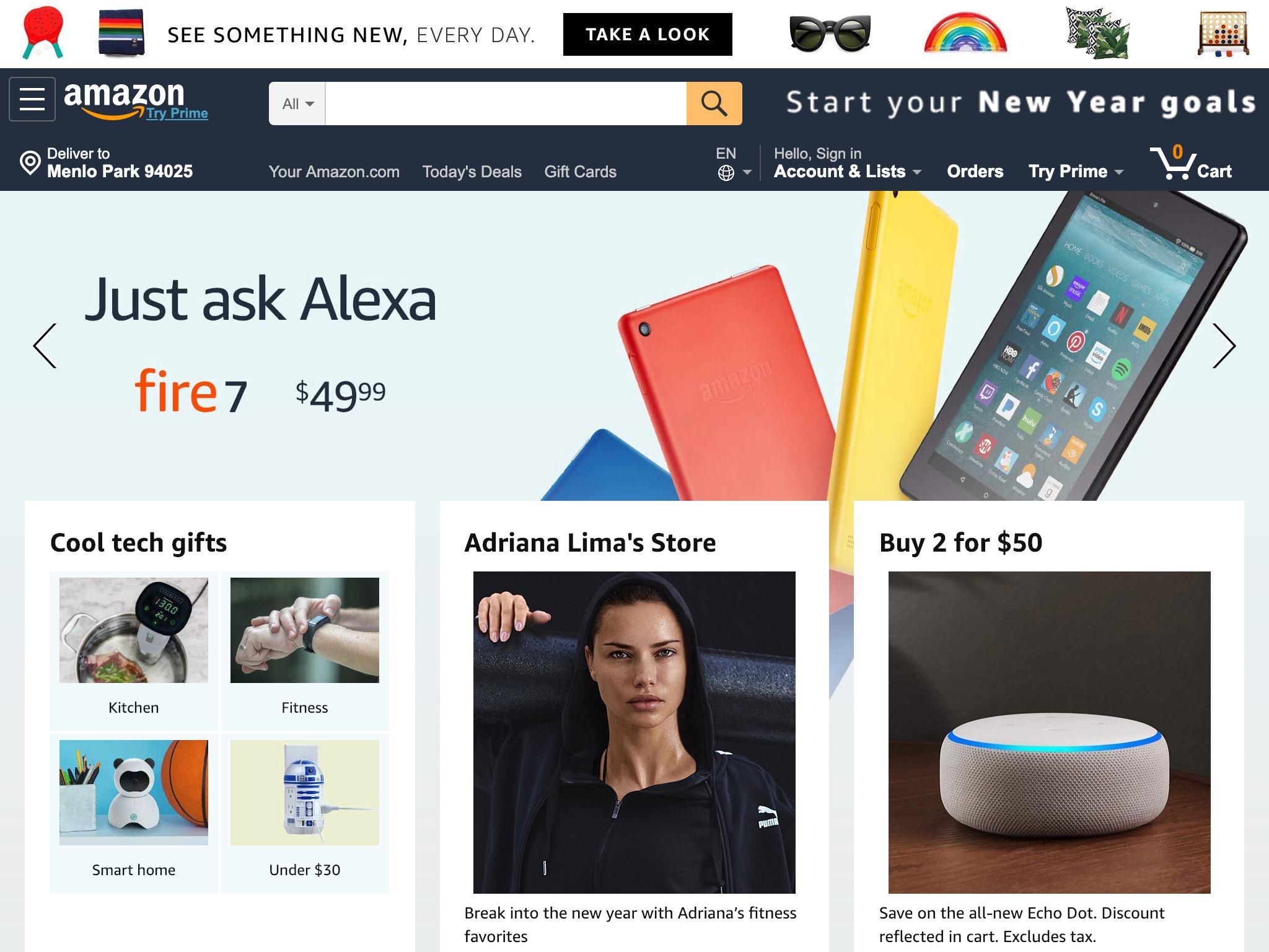
Amazon
While Amazon has added nearly 800 billion dollars to its market cap and countless product lines and services over the last decade, the site seems to have become simpler, hiding most things behind menus.
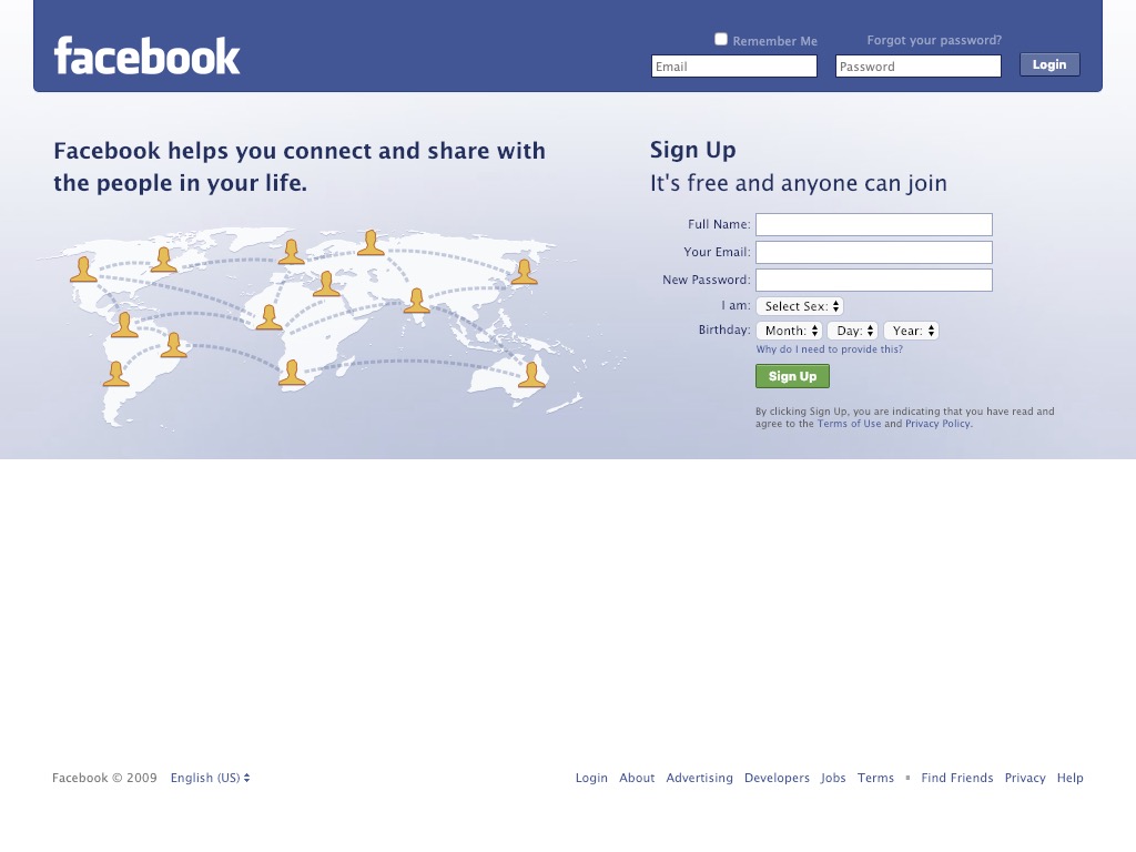
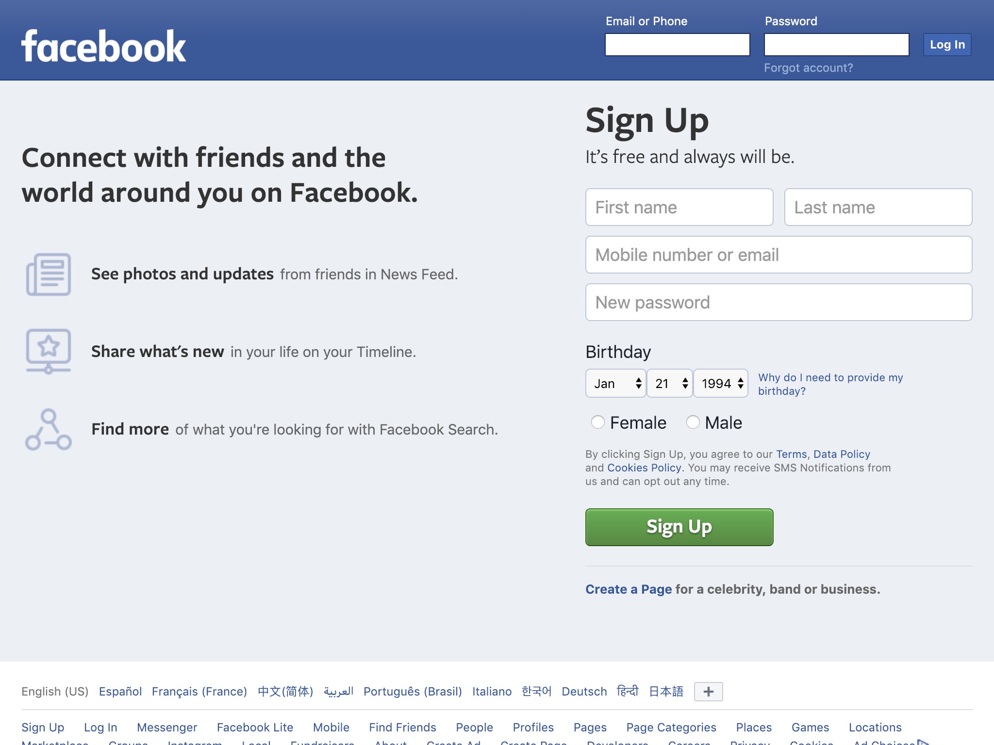
Facebook is well-known for being data-driven in its design decisions and not changing things that aren’t broken. Its home page is a perfect example. Little has changed aside from its 2015 redesigned logo.
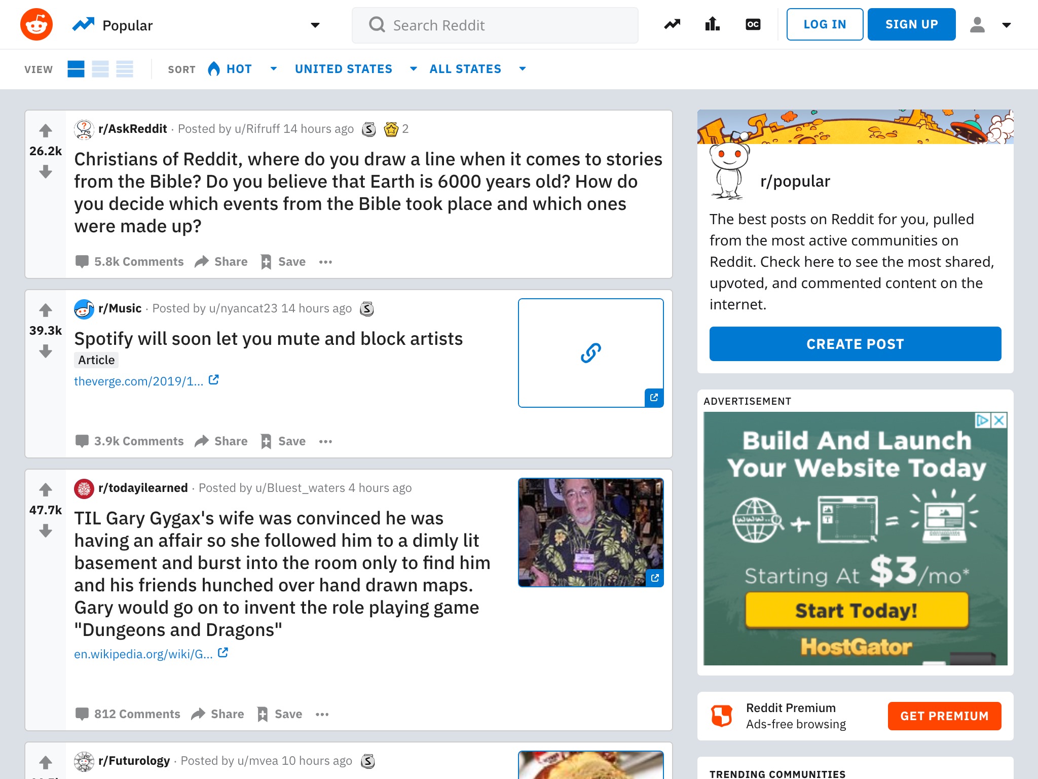
Reddit actually survived most of the last 10 years with few visual changes until mid-2017 when the current design was announced and mid-2018 when it started to roll out to large groups of users.

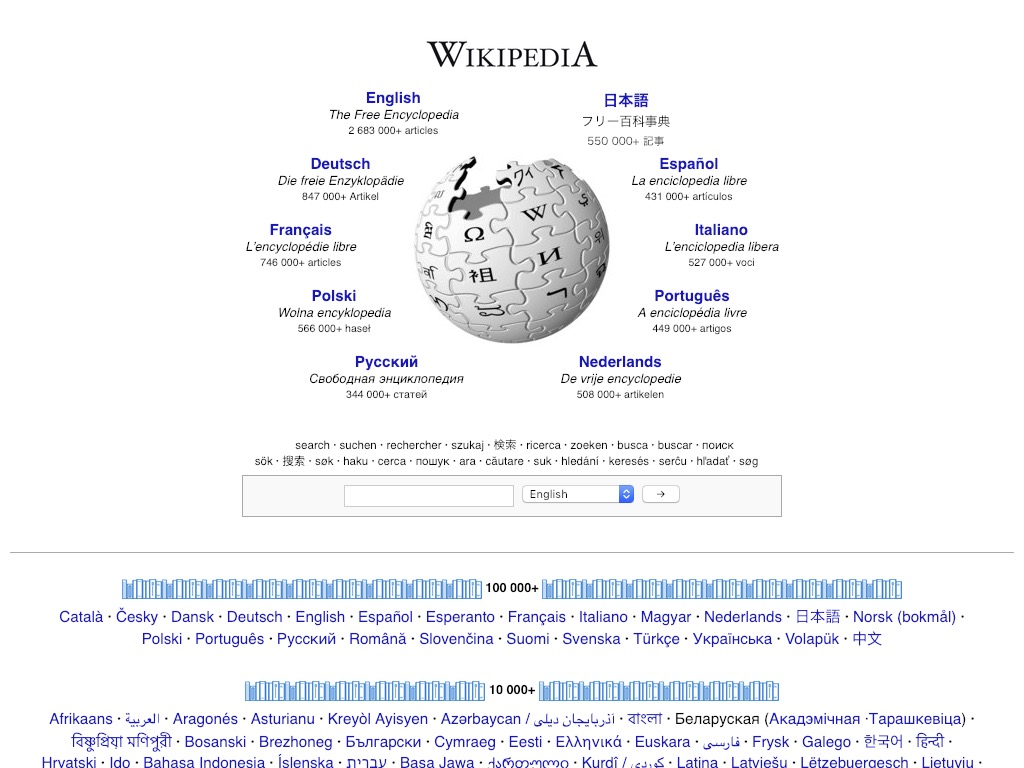
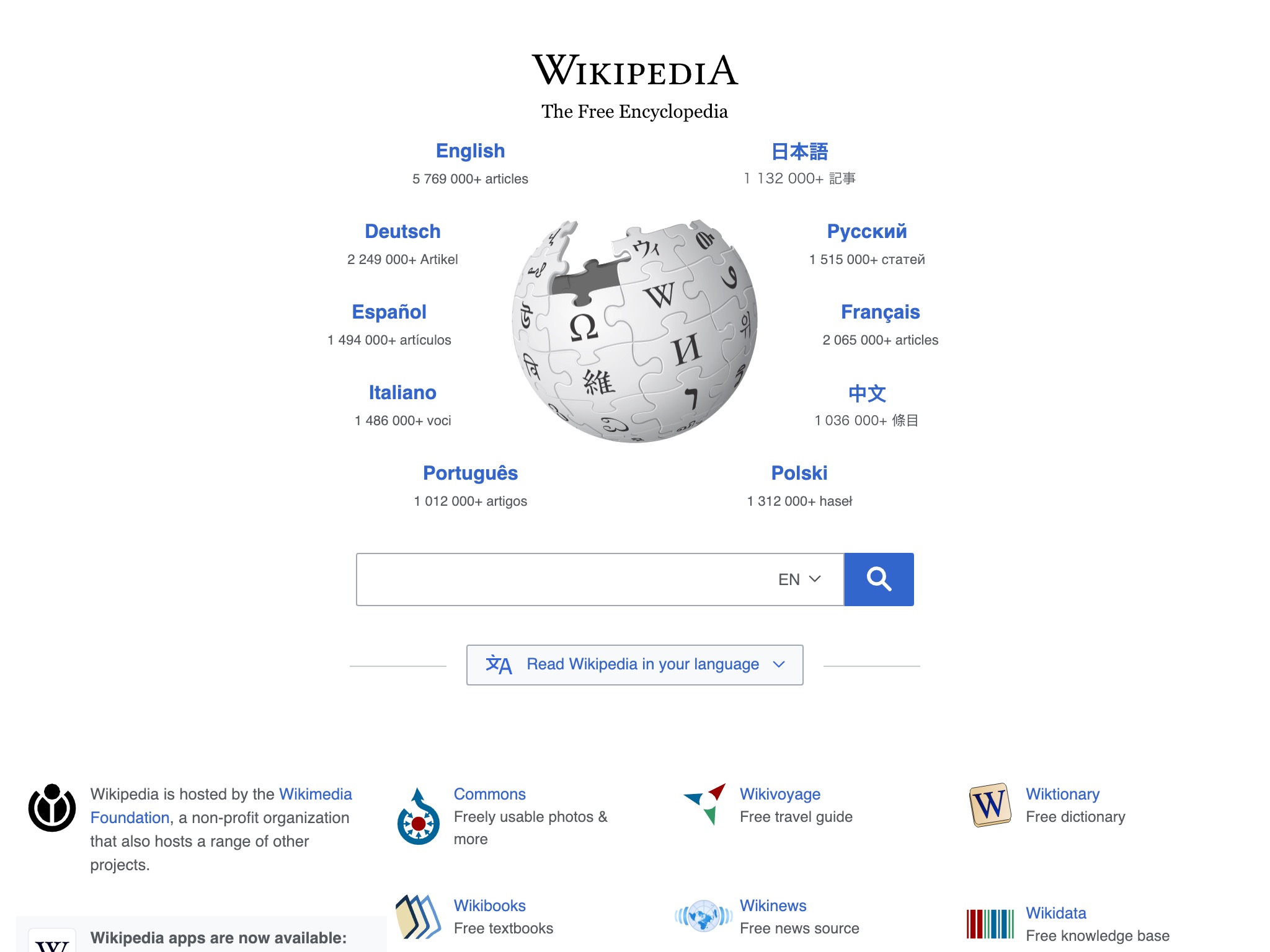
Wikipedia
Wikipedia’s familiar circular language picker has changed little in the last decade aside from the list of languages represented.
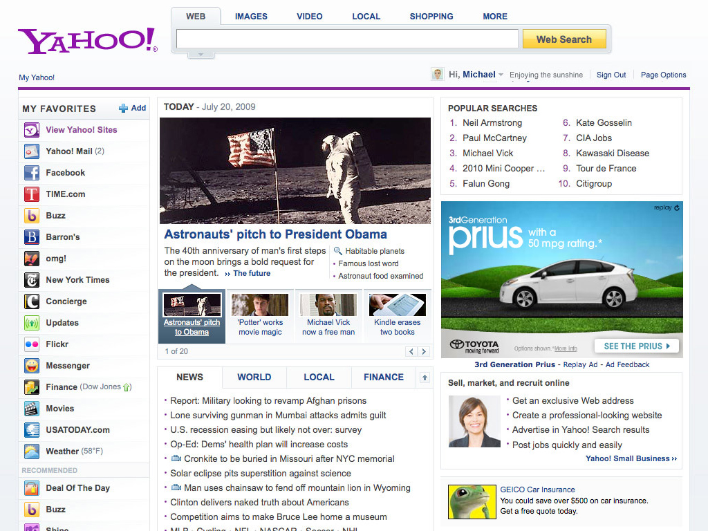
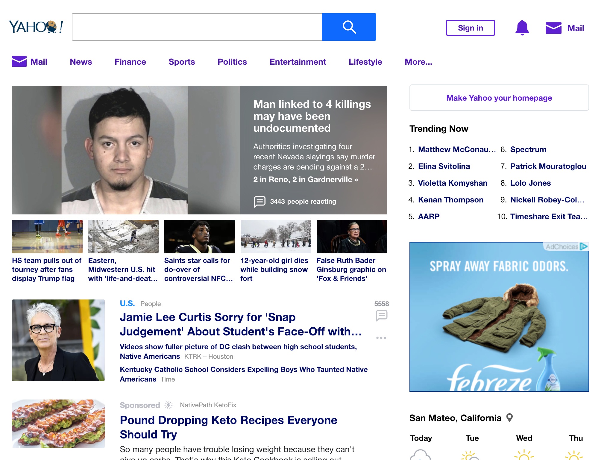
Yahoo
Yahoo may be a new shade of purple and may have a new logo, but it still maintains its jam-packed layout.
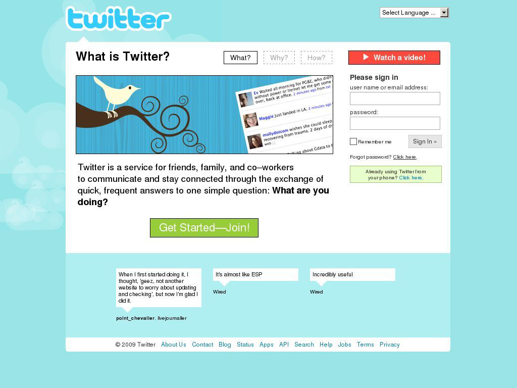
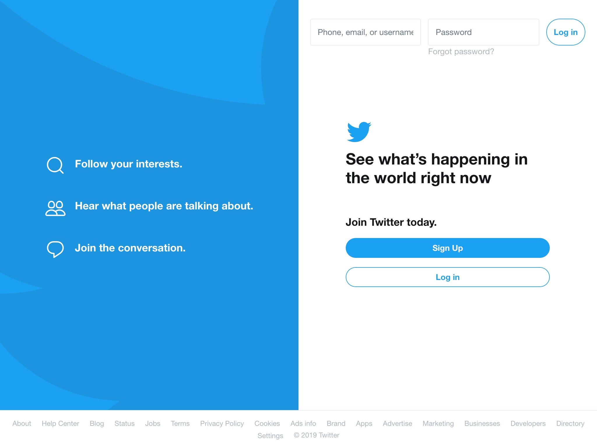
It’s easy to forget that back in 2009, Twitter was still competing with Facebook, Myspace and others in the hot social networking arena. I find it funny that it had to explain what it did in so many words. Now it’s a household name not requiring any explanation and the homepage is simple and to the point.
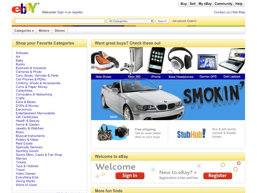
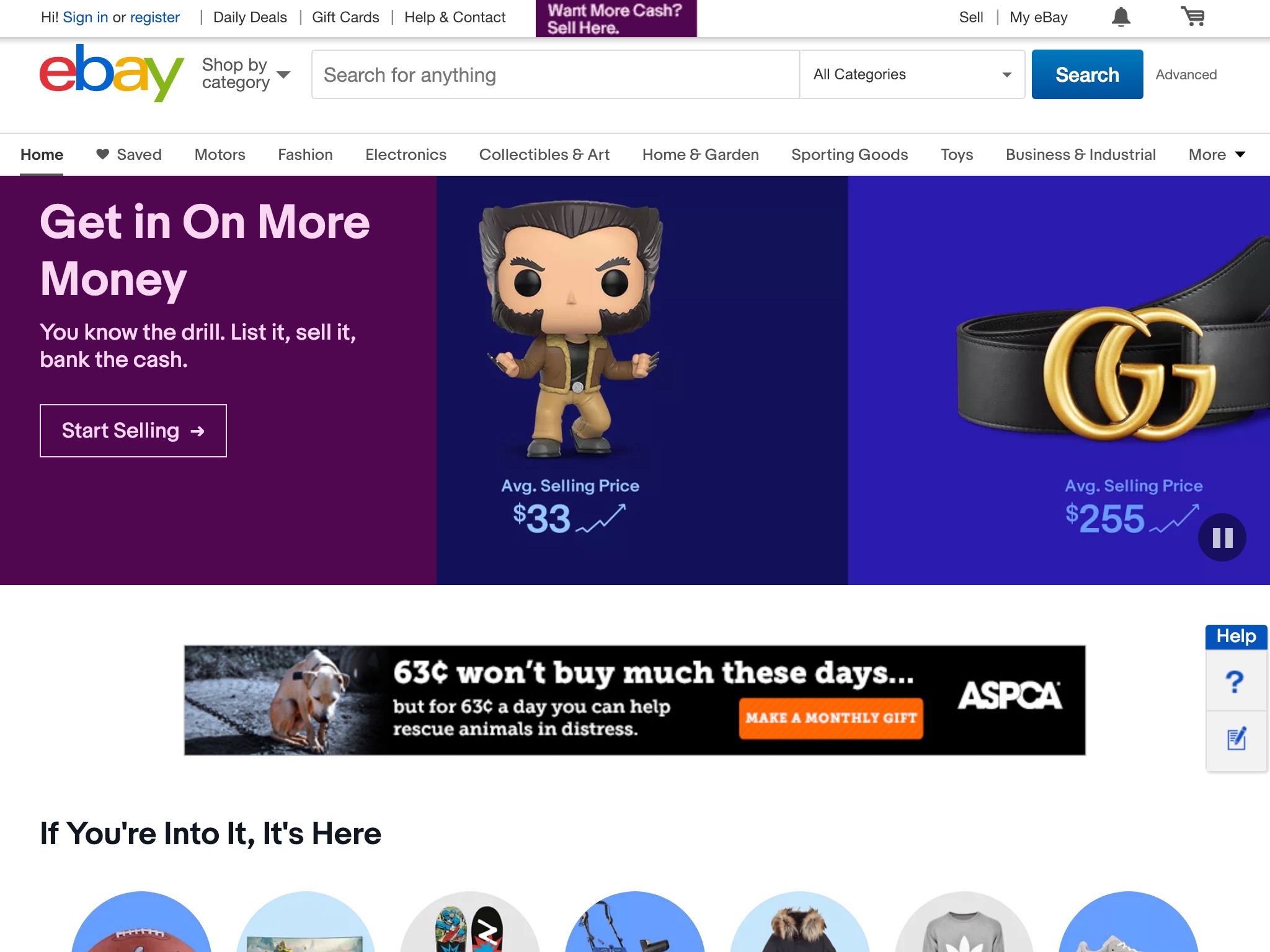
eBay
In the last 10 years, eBay has shed a lot of color in its user interface and has tried to position itself as both an e-commerce site and a way to make money.
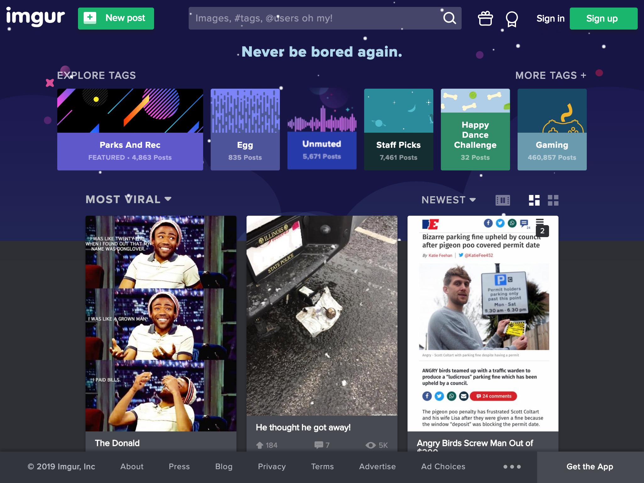
Imgur
10 years ago, Imgur was little more than an image host built for Redditors by a college student. Fast forward and it’s now one of Alexa’s top 20 most-visited sites in the US.

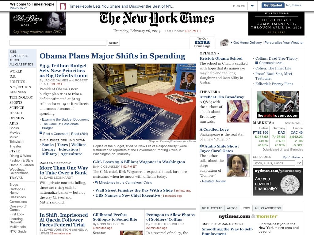
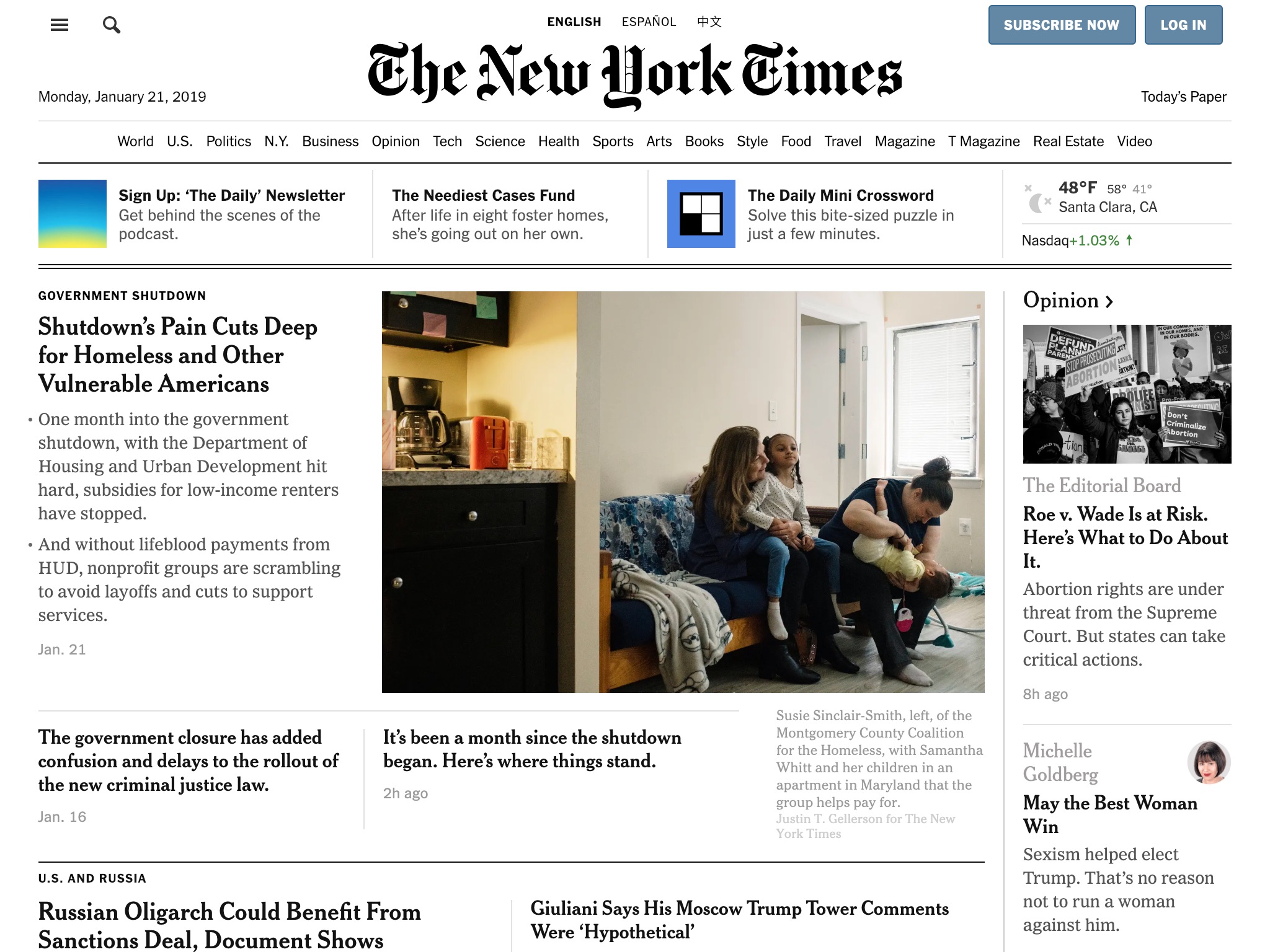
The New York Times
The New York Times website has visually become more and more like a print newspaper, with simple flat lines, black text and a 4-column layout.
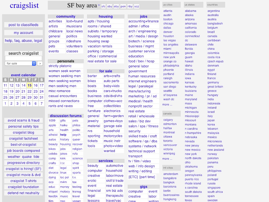
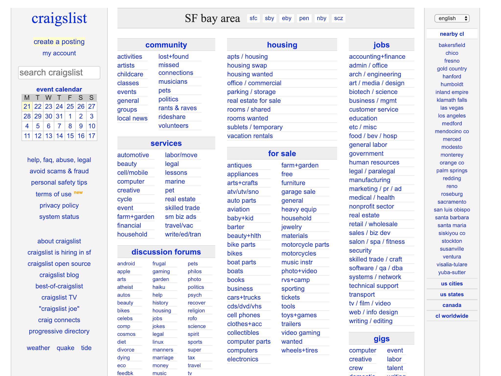
Craigslist
Craigslist is well-known for changing very little since its founding in 1995. I was expecting to see almost no change in the last 10 years, but I’m surprised to see more white space, bigger text, and a better use of space.
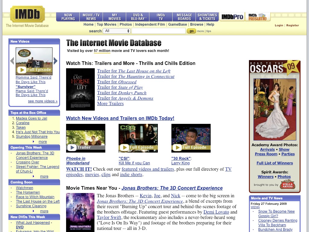
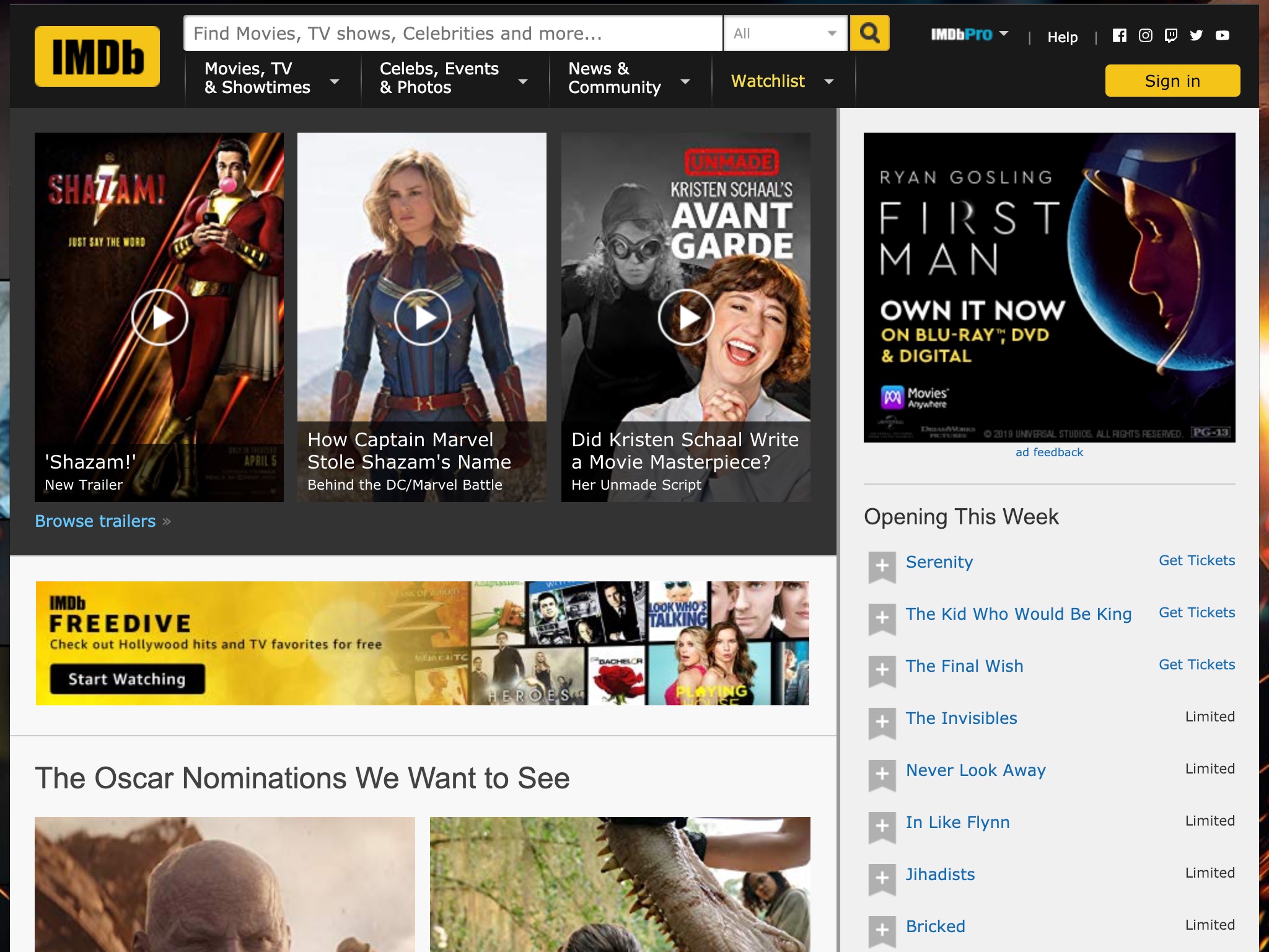
IMDB
IMDB has stripped away quite a bit over the last 10 years to focus mostly on video content, awards, and openings.
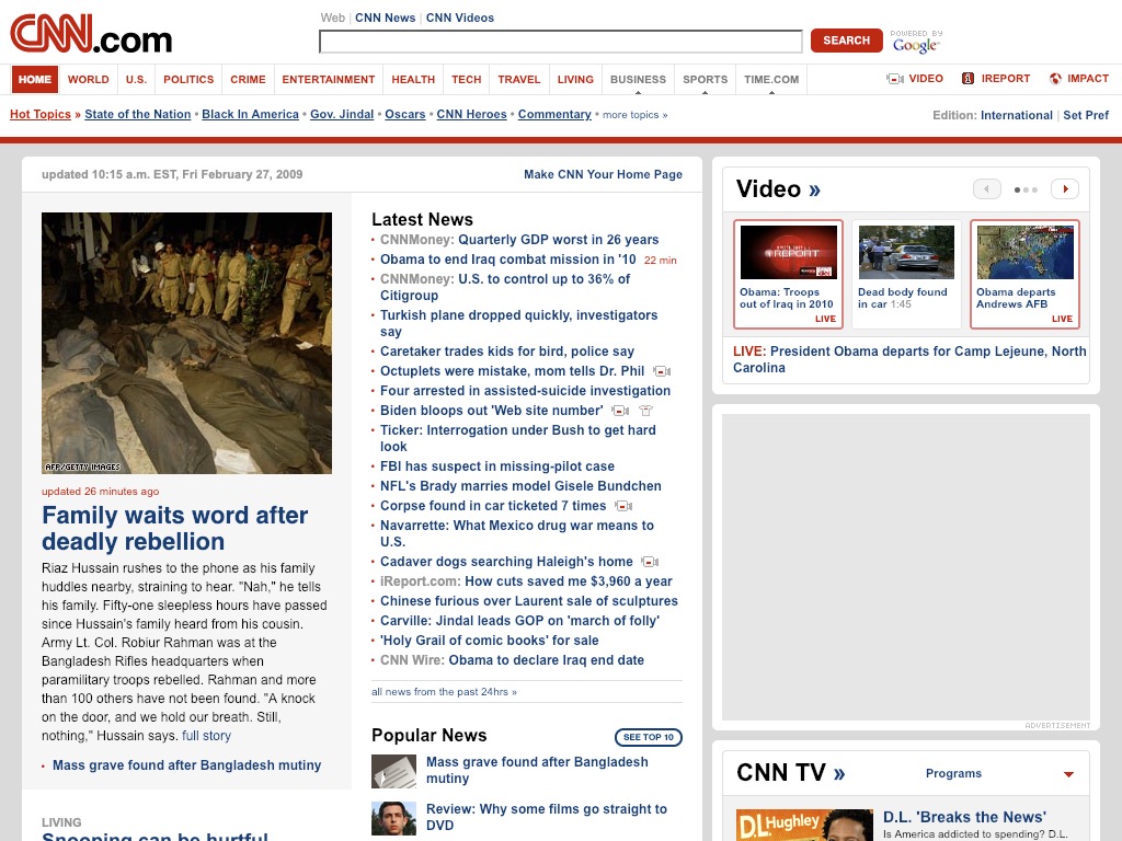
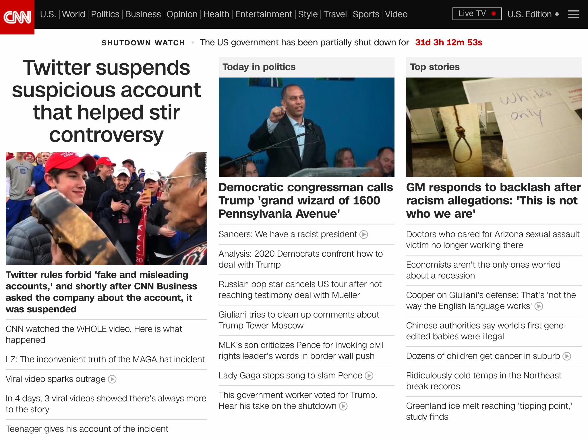
CNN
CNN, just like the New York Times, has a simpler layout with more visual hierarchy and larger text.
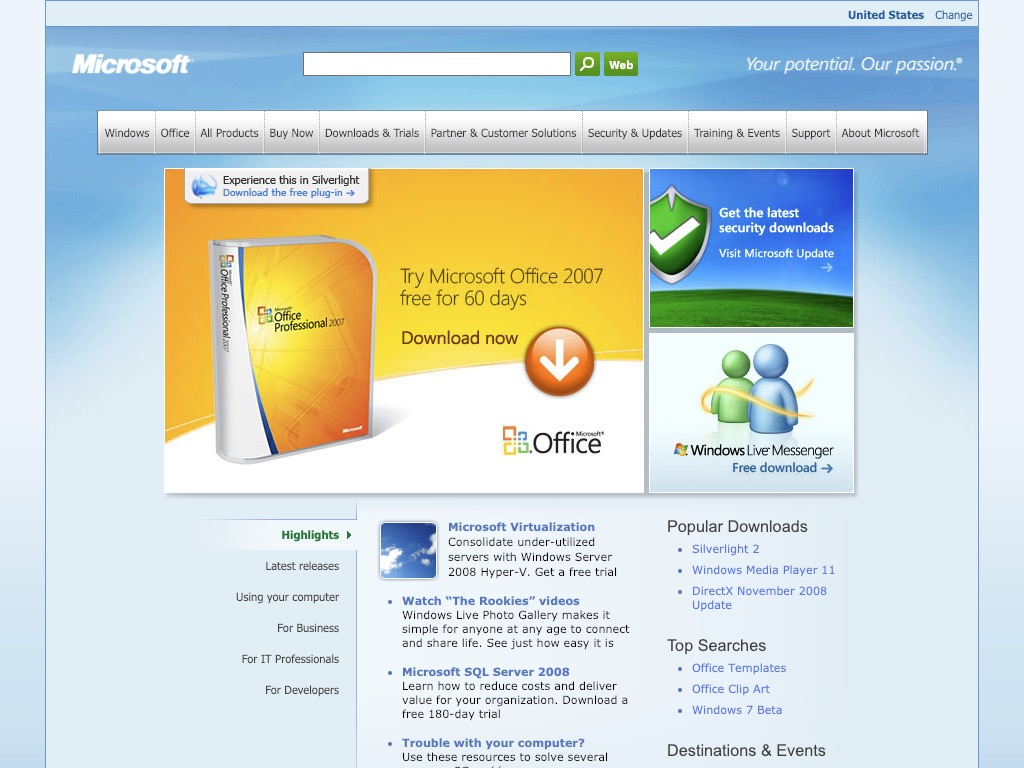
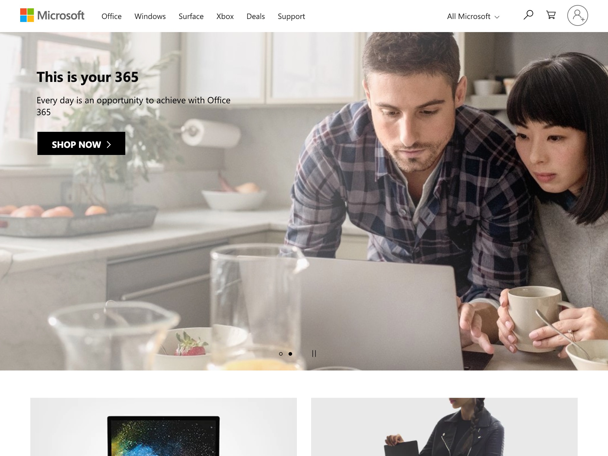
Microsoft
The Microsoft of 2009 was a completely different company. Just look at the labels on the navigation bar in 2009 and 2019. They show how much the company has shifted its focus from technical software to tools for consumers’ lifestyles.
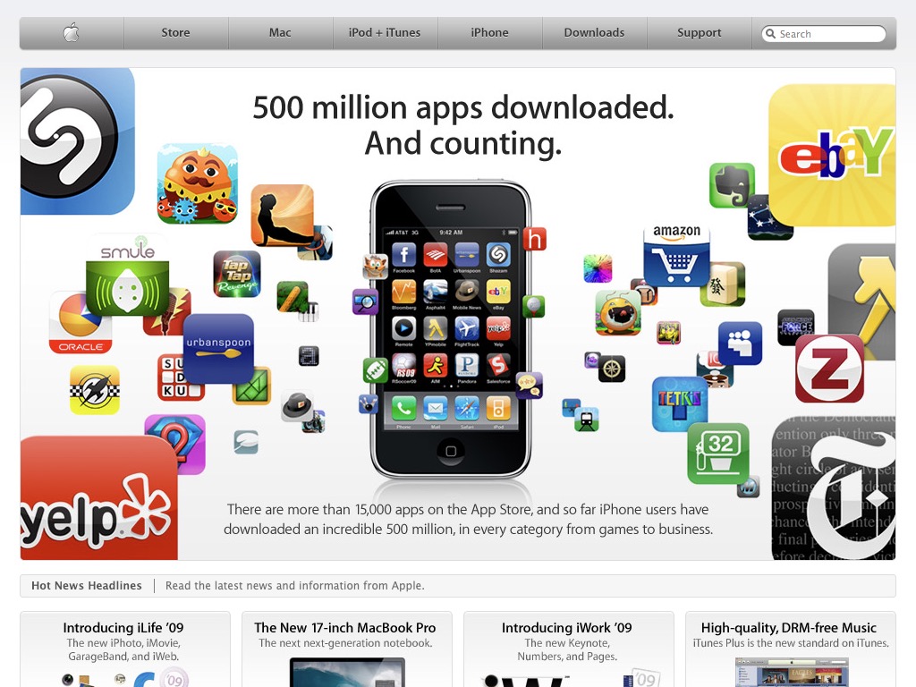
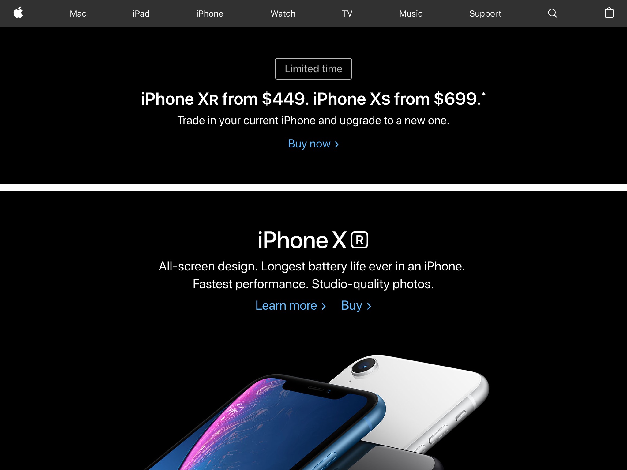
Apple
10 years ago, the iPhone App store was 6 months old and was celebrating 500 million app downloads. Now, the store has sold more than 130 billion apps. That’s 260 times as many. The main site has a new design language with larger type and full-width imagery.
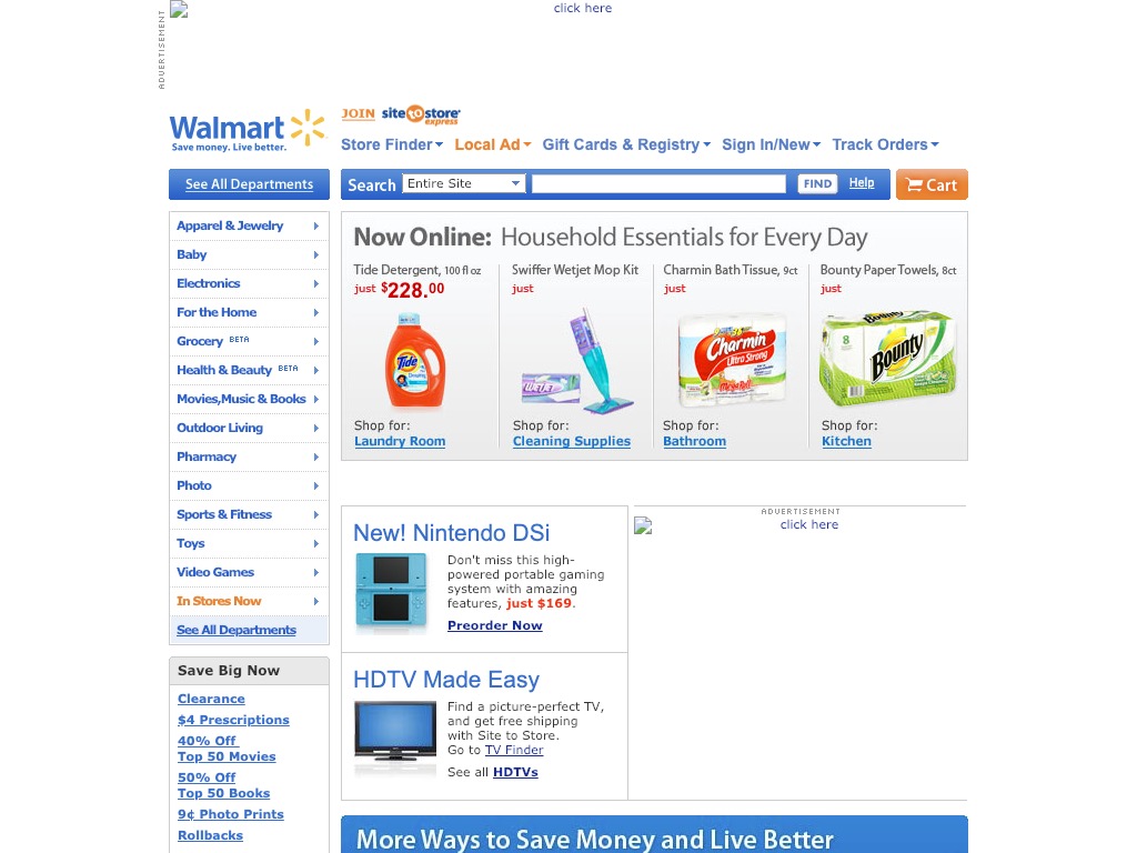
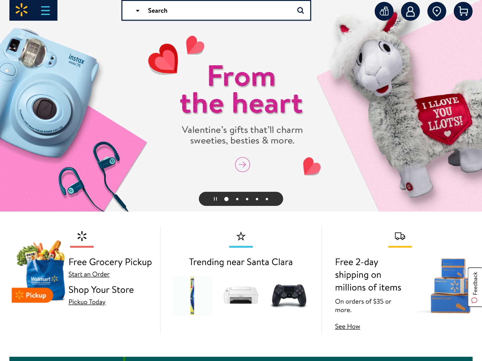
Walmart
Walmart has simplified its site just like many others with more whitespace and less content.
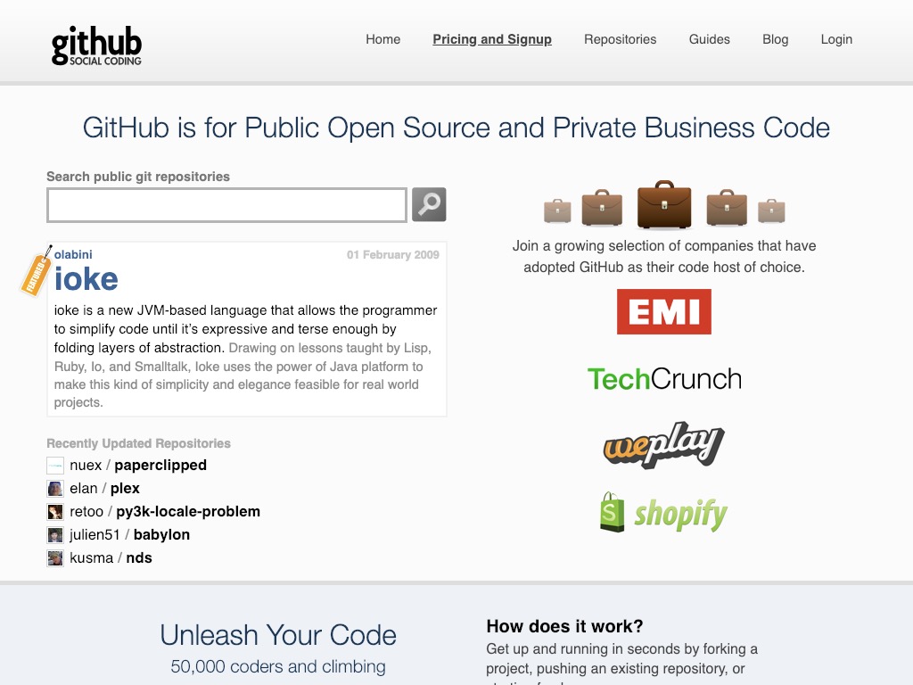
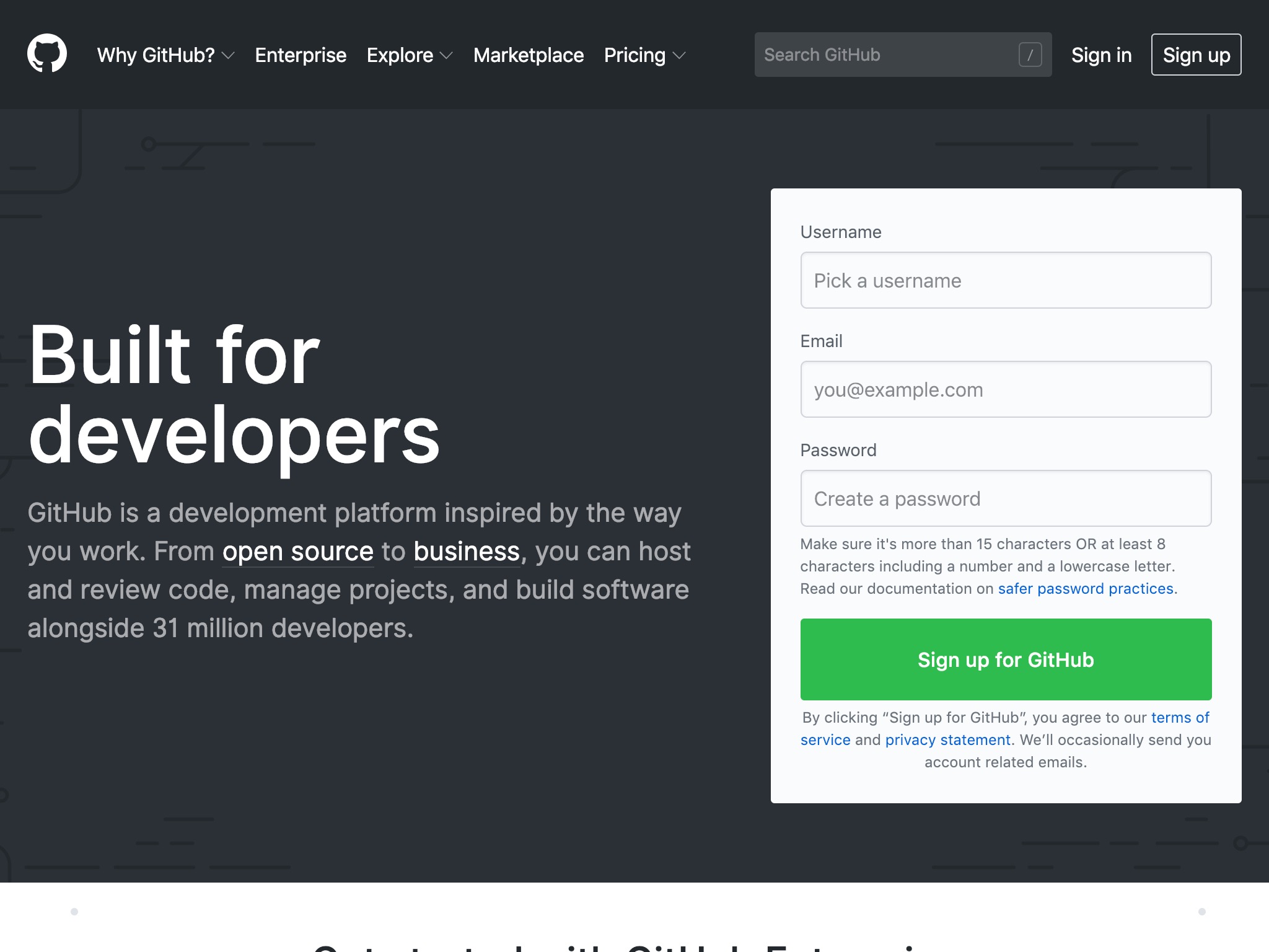
Github
10 years ago, Github was nearly 1 year old and was quickly building its following that would later cement it as the default place for hosting open source repositories.
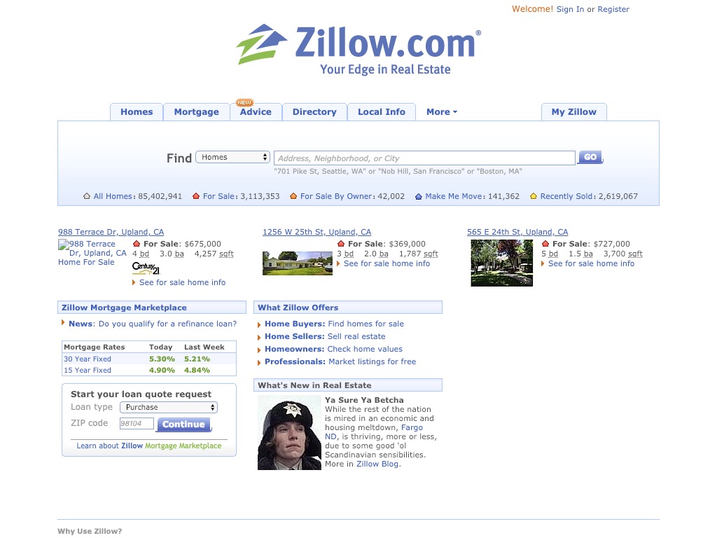
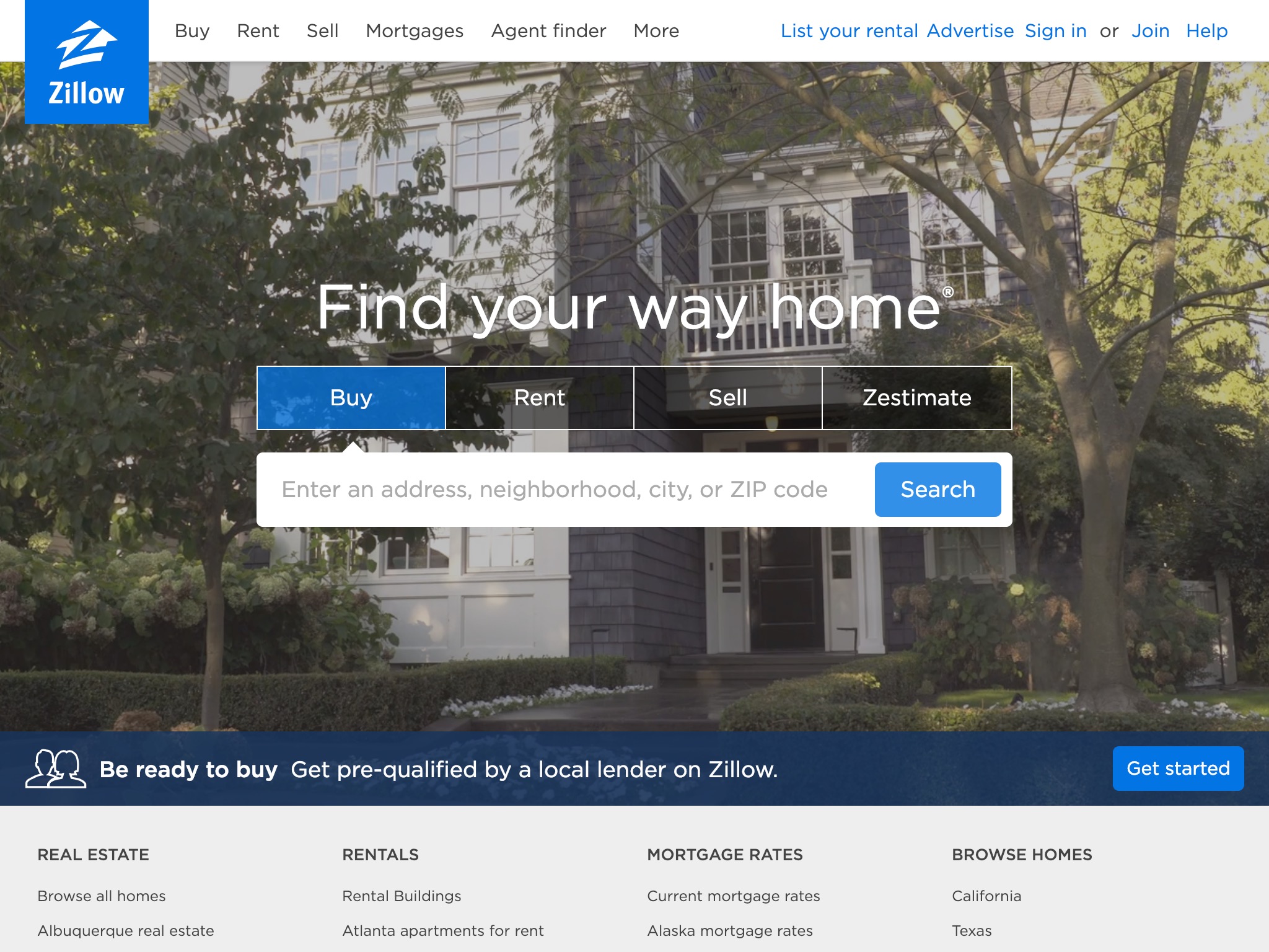
Zillow
It seems like Zillow has focused its homepage on just the few most common use cases while moving everything else to the header and footer.
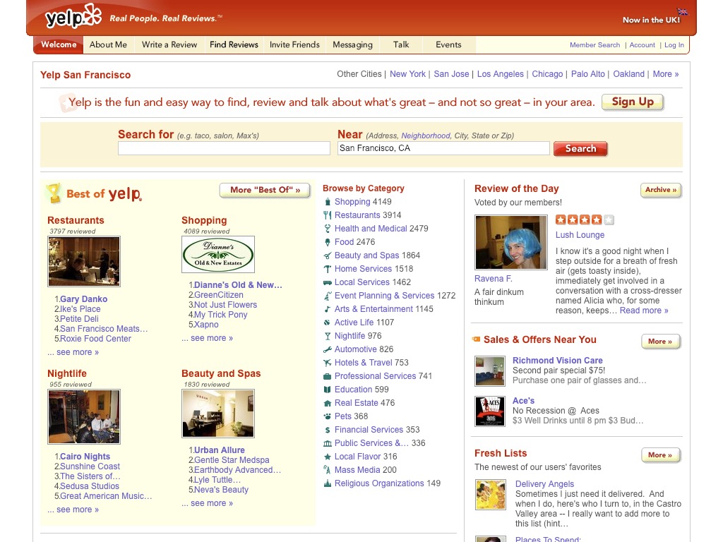
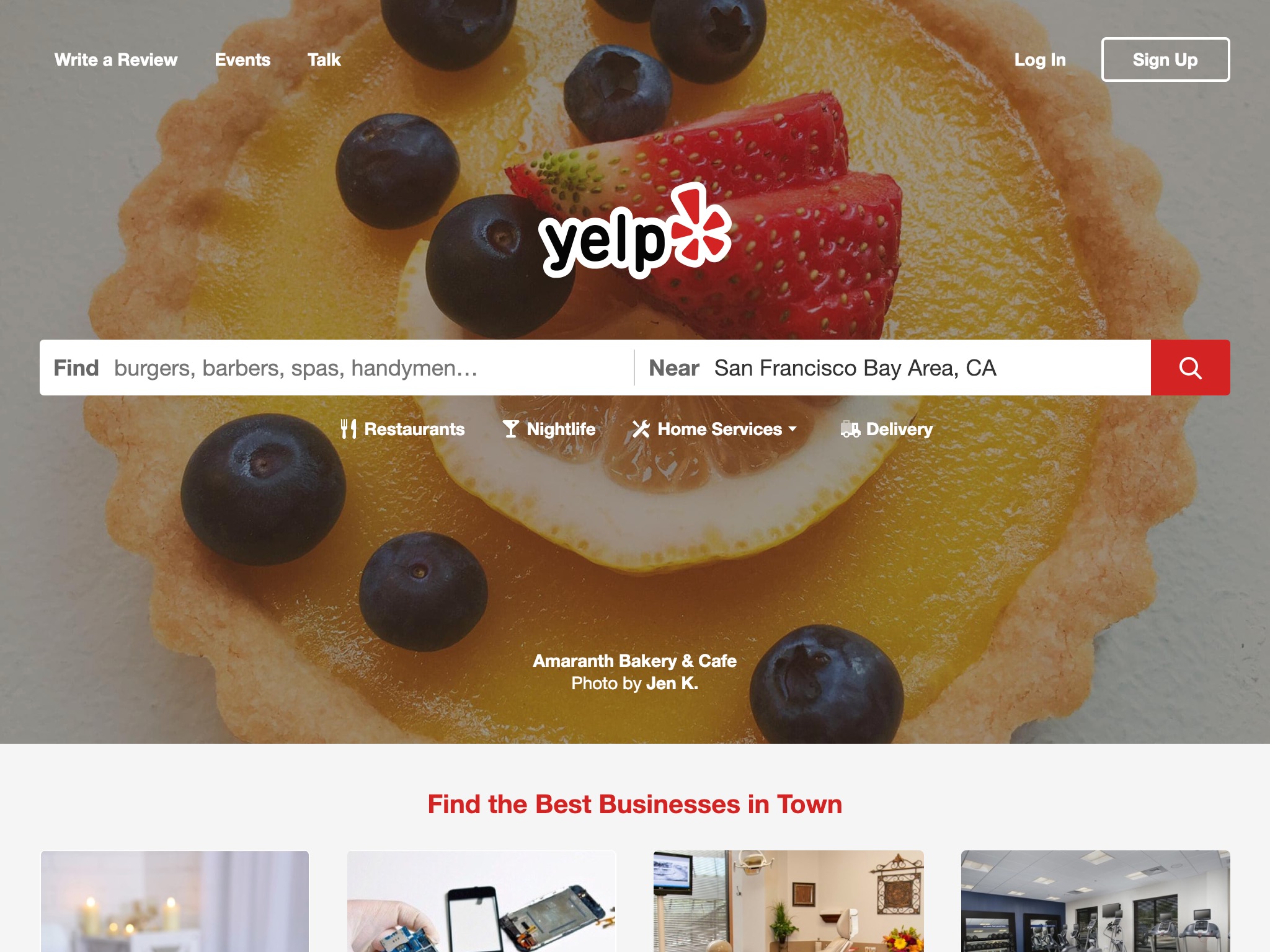
Yelp
Yelp is another example of focusing on the most popular use case, finding a restaurant nearby.
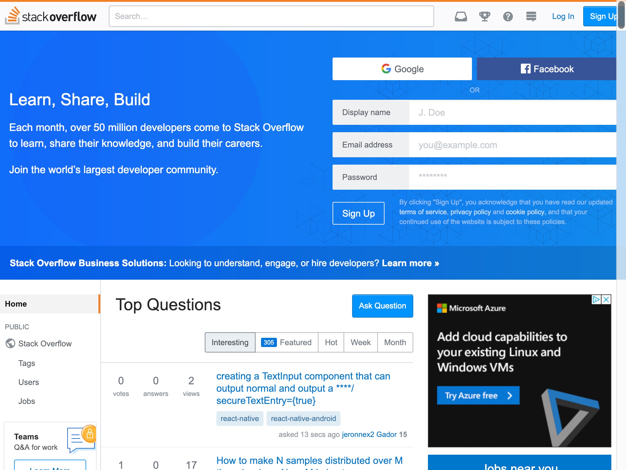
Stack Overflow
Stack Overflow still has its listing of top questions, but it has dedicated quite a bit of its homepage to converting new users.

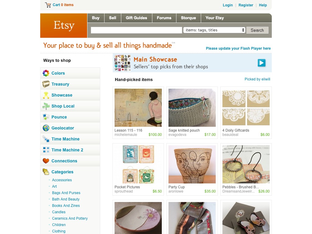
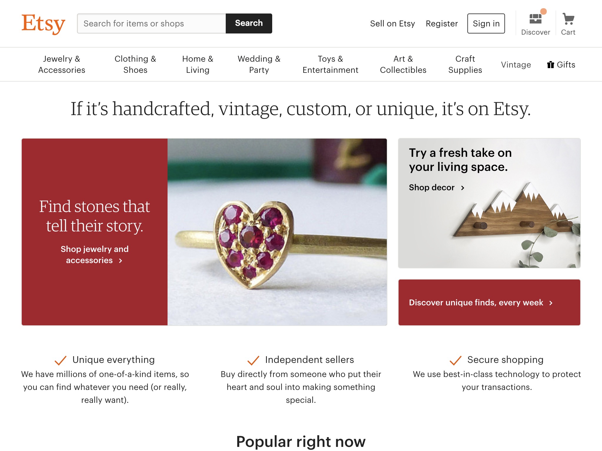
Etsy
In the last 10 years, Etsy has shifted to be not just a marketplace for handmade items, but an e-commerce site for also finding vintage, custom or unique items.