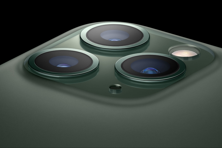
The industrial design of Apple’s latest phones hasn’t changed much from previous generations. They have stuck to the tried-and-true formula introduced with the 8 and X. However, there is one detail in the iPhone 11 Pro that is entirely new and quite clever, the logo.
To see this, we first need to take a close look at the backs, and specifically the logos of past iPhones. The 8, X, XS, XR and 11 all follow a technique pioneered with the iPhone 4.
First, a shiny metallic logo is applied underneath the back glass. Then, a layer of color is applied, providing an opaque back.

The most obvious difference with the iPhone 11 Pro is that the back now sports a matte finish. I suspect this finish is achieved using chemical etching (it could also be done using bead blasting). The camera bump, however, is left with the natural glossy finish of the glass.

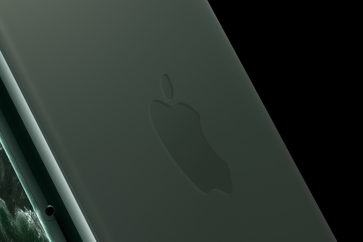
When we look at the logo, we see that it too has a glossy finish.

Apple has simplified the way it applies its logo to the iPhone 11 Pro. Just like the camera bump is masked off when applying the matte finish, so is the Apple logo. The resulting effect is very subtle. The Apple logo still shines and stands out from the colored back. Simultaneously, it’s better integrated with the rest of the device.

The difference between the logo and the rest of the back is most easily seen in a segment of the iPhone 11 Pro design video.
I hope all of you receiving your iPhone 11 Pros in the coming days appreciate this little design detail.
Thanks to Q for reading drafts of this.