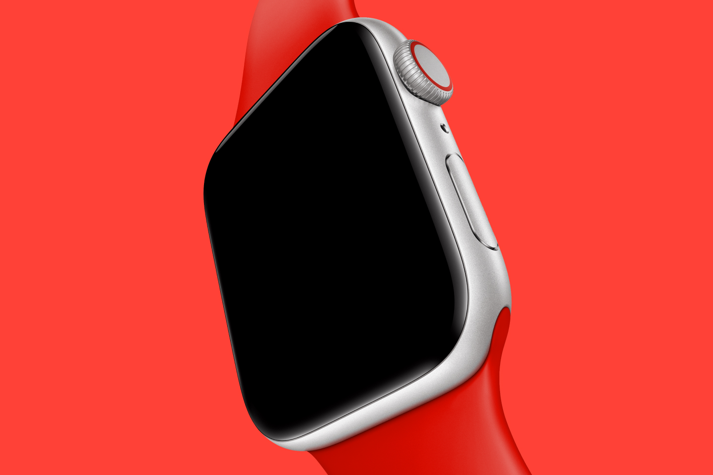
In my previous essays about Apple Watch faces, we saw how Apple transformed classic watch archetypes into unique digital equivalents.
These faces, like Chronograph or California, refer to specific categories that any watch aficionado would recognize.
Apple’s latest watch face, Metropolitan, is a bit different. While it references timepieces from the past, there is no single dial design or wristwatch archetype it points to. Instead, there are subtle connections to nearly a century of fine watchmaking.
Ever since the introduction of the Apple Watch, I imagined a face quite like this one. When I first saw Kevin Lynch present the face at the 2022 WWDC keynote, I was smitten. Unsurprisingly, it’s far better than I envisioned.
A glance at the Metropolitan face
To understand this face, let’s deconstruct it a bit. The equation is simple. Twelve numerals are arrayed radially around the dial. Numbers nine through three have their tops facing to the outside, while the others are flipped, meaning no upside-down numerals.
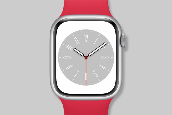
This arrangement mirrors the roman numeral dials seen on dress watches. With Arabic numerals, it’s less common. In the vast majority of watches, the numerals face in one direction.
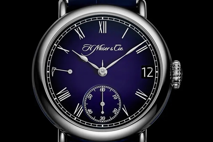
Now, the question is did Apple invent this face, or does it have historical roots?
The myth of the Bauhaus watch
To find the answer, we need to travel to the Bauhaus in early 19th century Germany. This iconic school is considered the origin of so much of what we consider modern design, like architecture, typography, industrial design, and more.
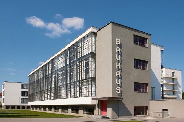
The Bauhaus building in Dessau by Walter Gropius (source)
Naturally, this prolific multidisciplinary school must have birthed a few watch designs, right?
Unfortunately, no. While a Google search for “Bauhaus watch” returns millions of results, there are no records of a watch being developed at the Bauhaus. The Nomos Watch Club goes into more detail.
The dial design that we today call the Bauhaus watch can be traced back to Weber and Baral[1]. This dial manufactory produced an array of designs that watchmakers integrated into their products. These dials certainly reflected the values and ethos of the Bauhaus, but they have no formal relationship to the school.
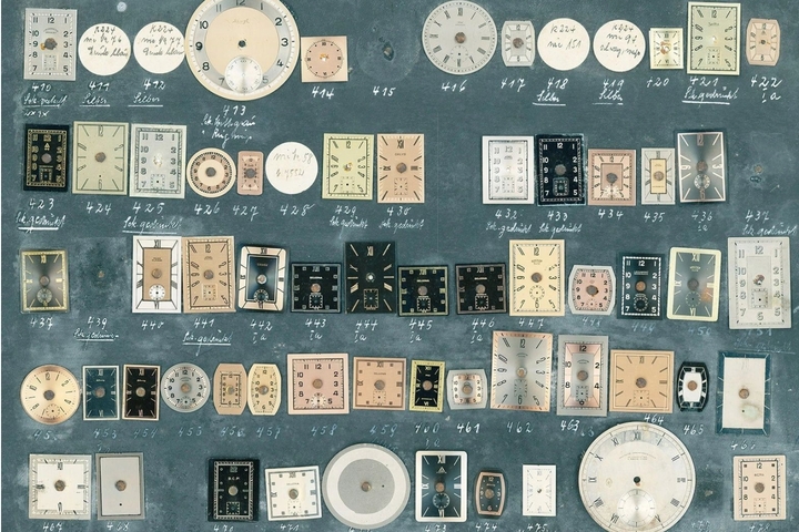
The 1937 Lange
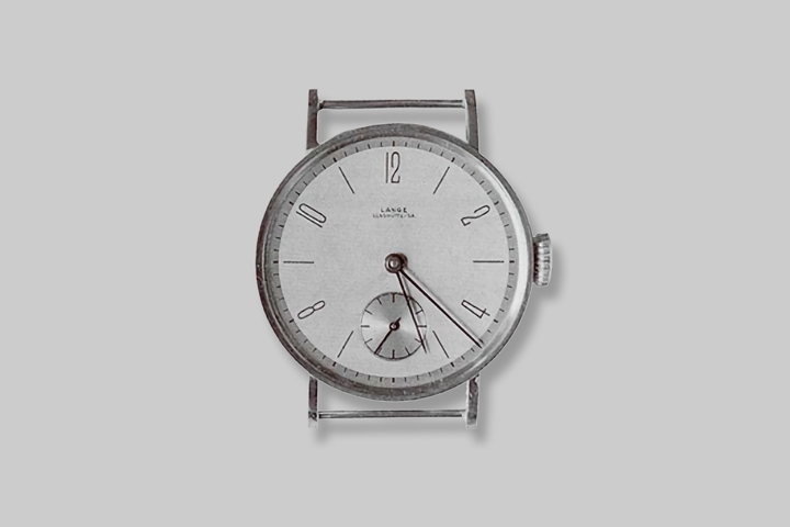
This brings us to Glashütte, Germany. A. Lange & Söhne, a renowned watch producer today, was an early customer of Weber and Baral. In 1937, they produced the piece below. The dial is both striking and simple. The even numbered numerals are produced in a light, condensed typeface. The 6 is replaced with a seconds subdial. Take a good look at this dial, because we’ll see it appear over and over.
Although A. Lange & Söhne no longer produces watches like the one from 1937, the basic paradigm still exists in their current lineup, like in this year’s Richard Lange Minute Repeater.
Stowa
Another one of Weber and Baral’s early customers is Stowa. Their Antea, also from 1937, follows a similar formula as the Lange. Nearly all the numerals are present in a similar typeface.
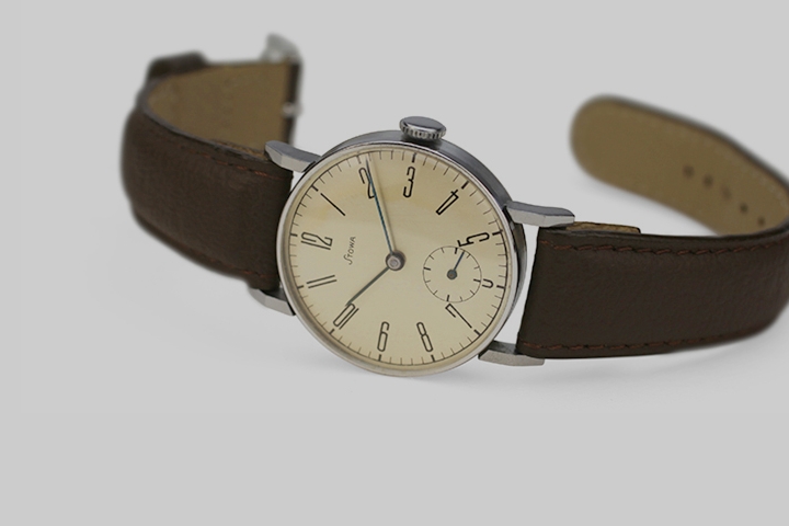
In 2004, Stowa ressurected the Antea with an updated version called the Antea Classic.
Later in 2015, Stowa released a watch with a connection to Apple. Named the Antea Back to Bauhaus, the watch was a collaboration with Hartmut Esslinger. He’s best known for founding frog design and developing Apple’s early Snow White design language. The numerals are set in a modified version of an old typeface created by Herbert Bayer at the Bauhaus.
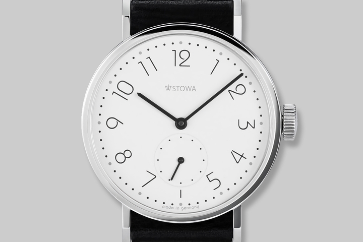
Other watches
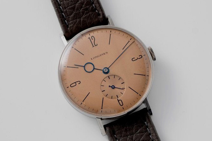
The Bauhaus-inspired dial design found its way into many other watches in the 1930s and 1940s. Another example is this dial seen on 1940s Longines timepieces dubbed “Calatrava.” The one below has numerals at the four cardinal positions and straight markers on the rest.
Nomos
Of all the companies that have produced Bauhaus-inspired watches, one stands the tallest these days, Nomos. The Nomos name is quite old, just like Stowa, Lange, and the like. However, the original watch company went out of business.
The name was revived soon after the fall of the Berlin wall by German entrepreneur Roland Schwertner[2]. While creating a new watch company in the historical watchmaking city of Glashütte, he purchased the names of defunct German watch brands. Ultimately, he chose Nomos.
He applied the same history-driven approach toward the design of the watches themselves. In the process of his research, he came across early Lange models from the 30s, including the one mentioned earlier. He then tasked graphic designer Susanne Günther with drawing up a modern interpretation. The result is the now timeless Tangente.
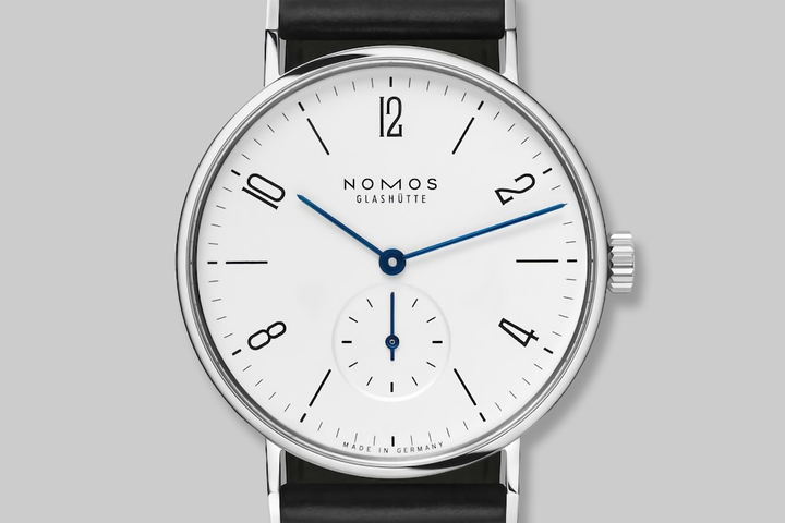
Over the decades, that watch has gone countless updates and modifications, but the dial design has remained essentially unchanged.
In 1999, Nomos released a special edition called the Lange Dial. Twenty years later, on the hundredth anniversary of the Bauhaus, they released another quite similar special edition called A Century Of Bauhaus.
The Metropolitan face
Like I said earlier, Apple’s face isn’t a reinterpretation of a watch category like Chronograph or California. Nevertheless, we can now see that the design does come from historical precedent.
This single face is the amalgamation of the watches we looked at and many more. In total, there are sixteen different variations you can use.
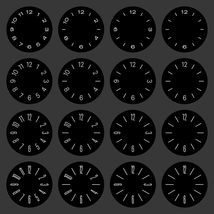
First of all, there are four different numeral arrangements. There’s one quite similar to the Stowa Antea with all twelve numerals. There’s one like the Lange and Tangente that has just even numbers. There’s also one with the cardinal numerals, and another with only twelve and six. There are also four different typographic variations, from wide to tall.
Turn your wrist away, and the numbers shrink into straight markers. Look at the watch again, and the numbers reappear.
Turning the digital crown morphs the text in a smooth continuous animation. Let go, and the text will snap to one of four settings. Quite a party trick, right?
Well, there’s more to it than meets the eye. This trick is showing off something quite special that Apple unveiled at WWDC this year — the expanded San Francisco font family. Apple custom made the font and applied it to nearly all their products. Previously it came in a limited set of styles and weights. Now, both weight and width are variable. So, if a particular weight or width isn’t just right, you can choose a custom number that sits between one of the predetermined options.
That’s the technology powering the morphing numerals on this face. So, while it is celebrating the history of Bauhaus-inspired dials, the Metropolitan face is also celebrating the flexibility of Apple’s typeface.
Therefore, could it be that the name Metropolitan is a subtle nod to San Francisco, the city so near and dear to Apple’s heart?
- Stowa Antea · Stowa ↩︎
- Nomos · Watch Wiki ↩︎
Thanks to Q for reading drafts of this.