
Inside arun.is · Design
6 min read Apr 7, 2020 Updated Feb 26, 2026
Update
arun.is has undergone a major overhaul. Read about arun.is 2.0 here.
In this series, I take you behind the scenes to see how this site is made. I share what I’ve learned over my last 12 years of writing on the internet, especially the last three years that I have been publishing here.
If you don’t already have a blog, I hope that this series inspires you to start one and begin sharing your unique perspective with the rest of the world. Otherwise, perhaps there are some tricks you can add to your tool belt or even some ideas you may have for me.
There are four pillars that arun.is rests upon: design, photography, writing, and technology. This issue focuses on the first and most fundamental: design.
Inside arun.is
Design is the most fundamental of the four because it is ultimately responsible for fulfilling the purpose of this site, telling stories from my point of view. Design involves not just color, typography, and layout but also defines how each of the other three pillars, photography, writing, and technology, are expressed in this medium.
This process involves using a variety of tools along the way.
However, tools alone are not enough and frankly aren’t that interesting. So, I delve deeper into some of the many decisions I made and their justifications.
Typography
Given that this is a written publication mostly about design, typography is its cornerstone.
I have learned everything I know about typography from the internet and books. An excellent book that is available for free on the web is Butterick’s Practical Typography. I would also recommend the free Better Web Typography email course.
Typeface
My design process began with choosing a typeface. I wanted something modern, readable, and optimized for the web. Coincidentally, right after I started working on arun.is, Rasmus Andersson released the first version of the Inter typeface (then known as Interface). I ultimately chose it because it prioritizes readability on screens over all else.
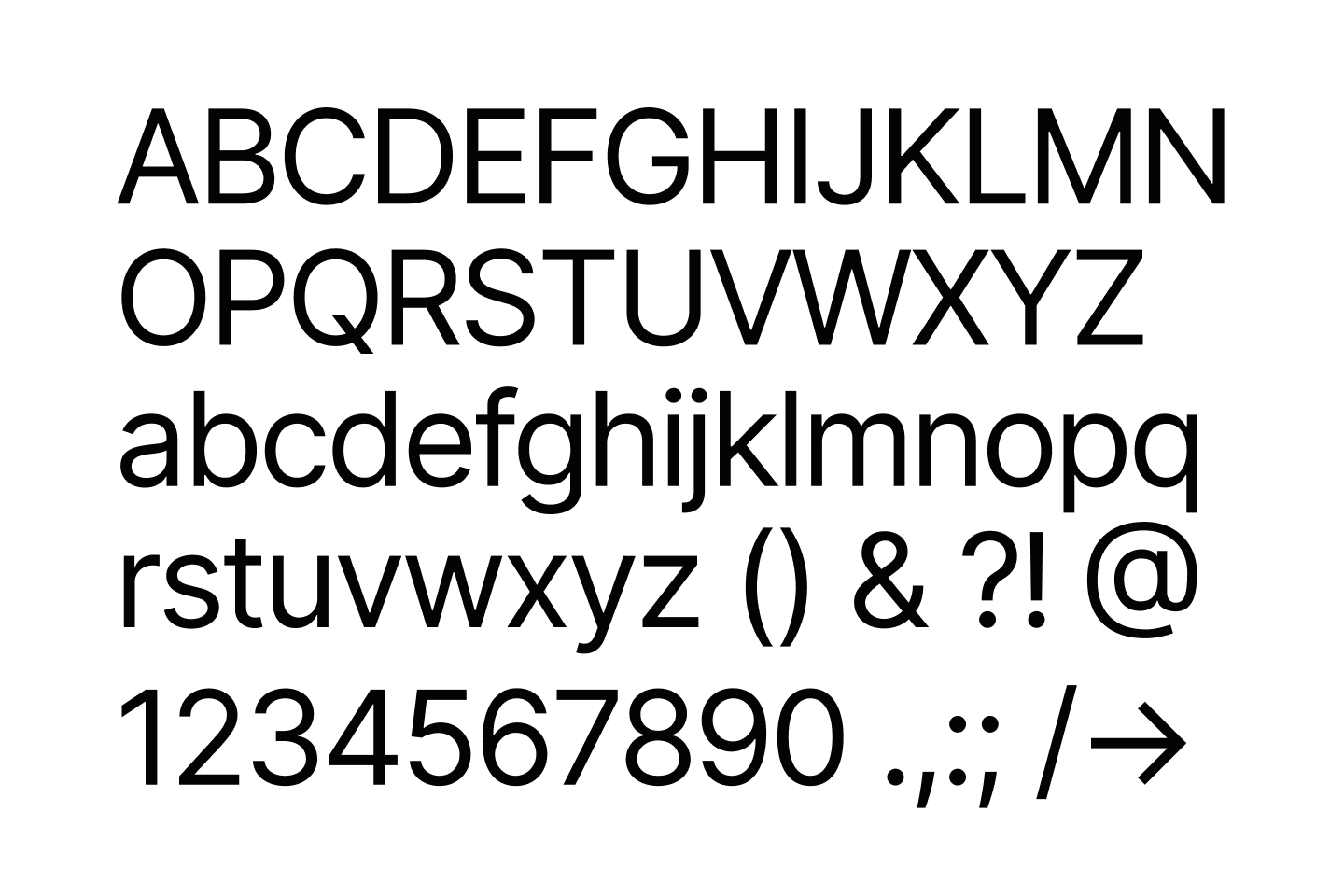
Alternatively, I could have used the system font stack, but I prefer consistency between platforms. So, instead of readers seeing words set in San Francisco on Apple products and Roboto on Android, all readers would see this blog in Inter.
With the typeface decided, I chose a type size and weight that would be readable in a variety of screen sizes. To keep things simple, I decided that both size and weight would stay constant regardless of screen size. So, the font-size would be uniform on desktop, tablet, and mobile.
Column width
The next step I took is choosing the widest column width, which would govern this blog’s appearance on desktop. Josef Müller-Brockmann, an expert on typography and layout, has some words to say on the topic of column width.
Just as overlong lines tire, so do overshort ones. The eye finds the long line strenuous to read because too much energy must be spent keeping the horizontal line in sight over a long distance. In the case of the too short line, the eye is compelled to change lines too often and this again wastes energy.
[1]
Instead of relying solely on theory, I studied the work of publications I respect, such as Monocle Magazine, the MIT Technology Review, and The New Yorker. I copied articles from each and adjusted the column width on my blog until the words-per-line matched.
Line height
The next parameter to dial in is the line-height, or as known in the typography world, the leading. Here are more words again from Josef Müller-Brockmann.
The eye cannot focus on excessively close lines and … the reader expends energy in the wrong place and tires more easily. The same also holds true for lines that are too widely spaced … Where reading is smooth and easy, the meaning content of the words is grasped more clearly
[2]
I use the Tachyons CSS toolkit. It, fortunately, has a lot of sensible defaults. One of them is line-height. 1.5x (where the line-height is 150% of the font-size) is usually recommended for long-form copy, and that is precisely the number that Tachyons uses.
Color
With the typographic elements decided, the next aspect to design is color.
Background and text
Like with typography, when it came to color, I prioritized readability as much as possible. There is research showing that using pure black and pure white can cause eye strain. If you look at a physical book or an e-reader like the Amazon Kindle, you’ll notice that neither the background nor the text is one hundred percent white or black. So, I selected a light gray color (2% black) that still looks almost white. Then I chose a darker color (80% black) for the copy.
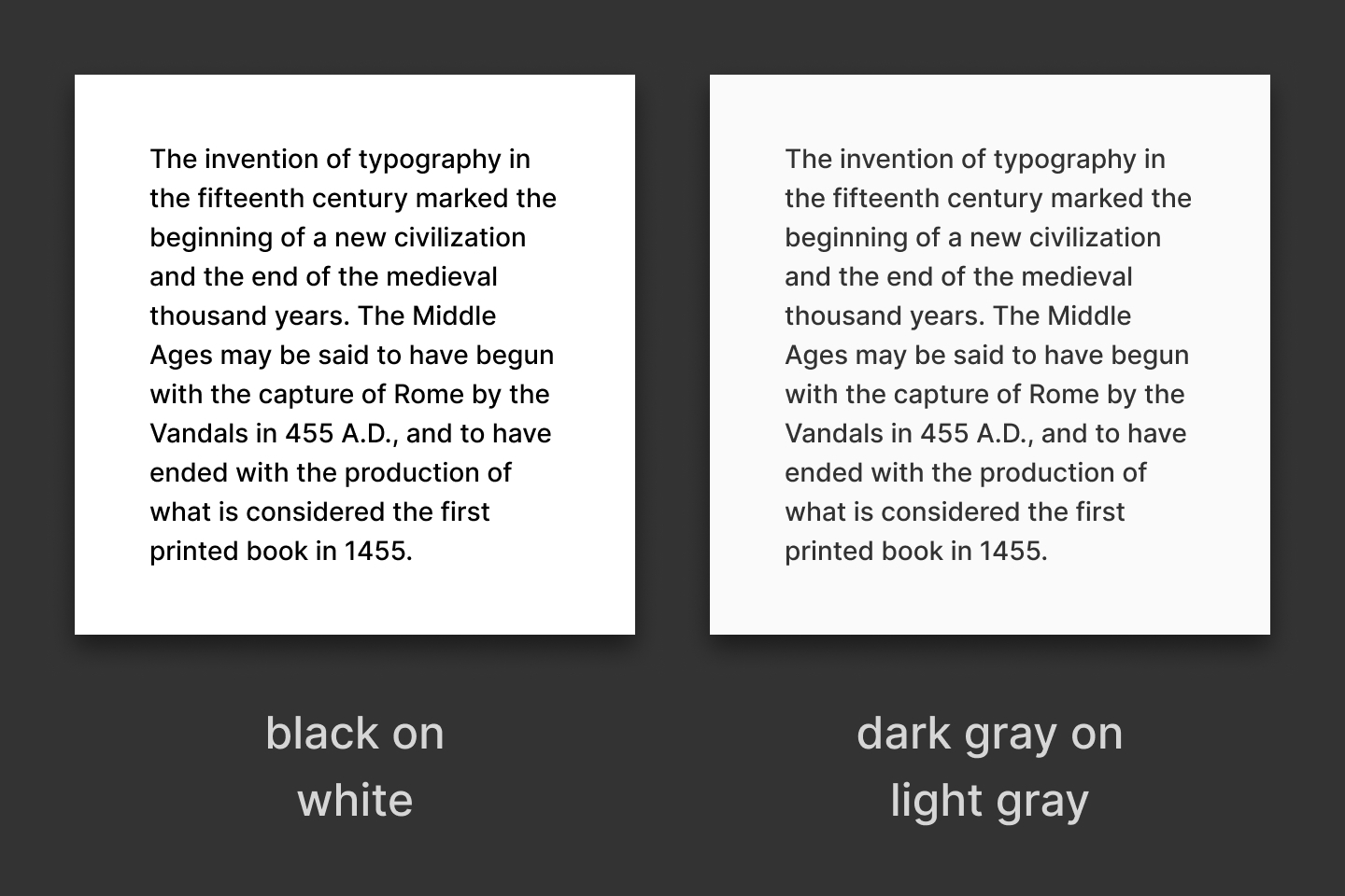
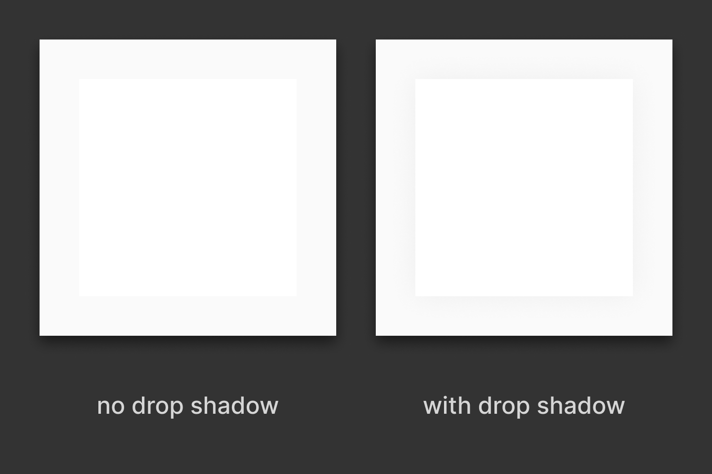
One added benefit of not using a purely white background is that images and graphics with a white background can stand out without using an unsightly border. To make them even more distinctive, I added a subtle, almost imperceptible drop shadow.
Post themes
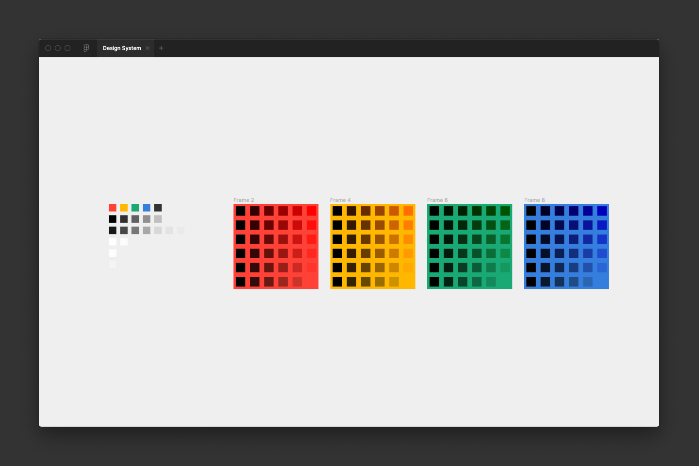
When it came to designing how each post would look, I wanted a sense of playfulness balanced with orderliness. So, I created color themes where each post would be a different color depending on its subject. I played around with a variety of different color palettes but ultimately chose a few colors from the Tachyons palette.
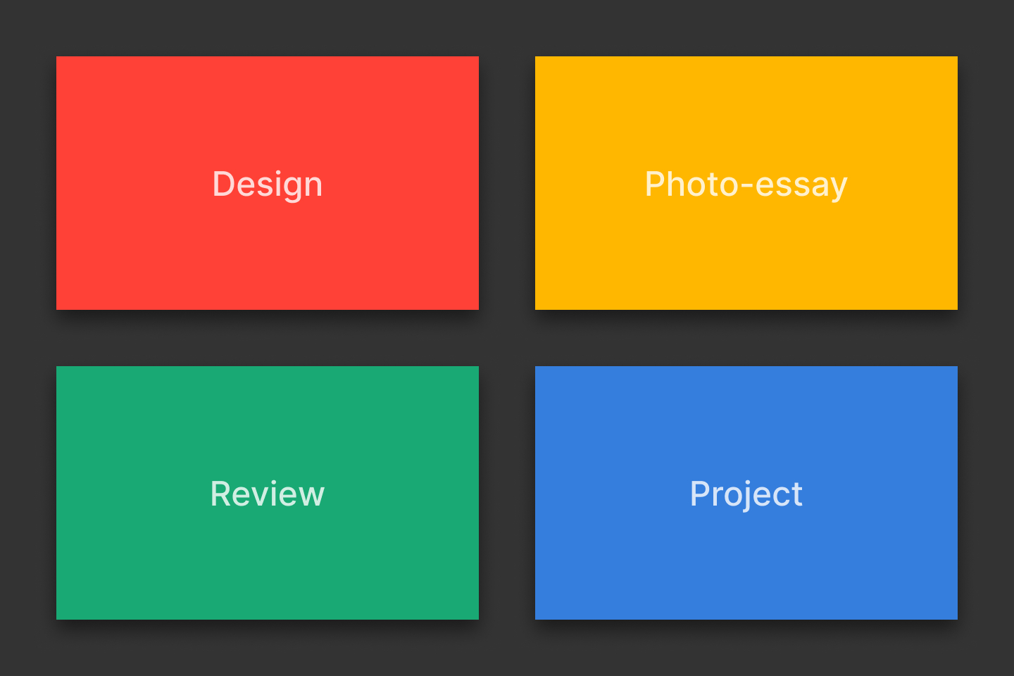
This theme color finds its way to the top and bottom navigation, links and illustrations within the post, and the cover image.
Cover images
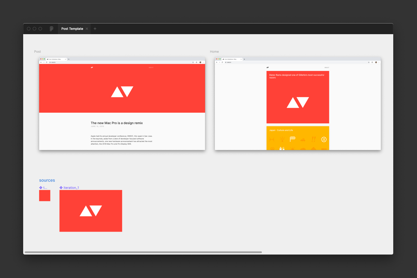
The idea of creating a custom cover image for every post started as a way to practice illustration and animation. Over time, it has become one of the unique features of this blog.
I used to begin each cover image with a blank canvas. I quickly learned that I could save quite a bit of time by making a template. So, I created a component-based Figma document that I can clone. It allows me to begin designing without much setup.
For animated headers, I tend to create gifs by exporting frames from Figma and turning them into animations in Photoshop. Using Photoshop allows me to carefully control the colors and quality of the gif. I also sometimes output cover images as SVGs and hand-code CSS animations that I include in a style tag within the SVG file. I have found Chris Coyier’s guides at CSS-Tricks quite useful.
I also made a design system document where I centralize and publish components, colors, or other styles that are common across the site. This document allows me to quickly start new files when I want to envision changes or additions.
What’s next
My design process has been very incremental. I developed everything I mentioned here over the years. This incremental improvement is what I love about software and writing on the internet. Over the next few years, I have many ideas of how I can continue improving and building upon the foundation I have set.
In the next issue of this series, I’ll dive into what I think is the second most crucial aspect of this website, photography
- Grid systems in graphic design · Josef Müller-Brockmann ↩︎
- Grid systems in graphic design · Josef Müller-Brockmann ↩︎
Thanks to Q for reading drafts of this.