
Leica Q3 concept
3 min read Nov 14, 2019
Update
As of May 25, 2023, the Leica Q3 is now available with almost all of the changes I recommended. It looks to be a great camera.
I’ve been shooting solely with Leica Q for the last two years. It has continued to be the most pleasurable shooting experience I’ve ever had.
The Q is derivative of the X series before it. The beauty of the X and Q series’ is in usability. They present most of the core functionality as physical controls. Leica built on top of the fixed focal length compact formula with a full-frame sensor and built-in viewfinder, among other smaller changes. Frustratingly the Q carried with it one of the X series’ usability issues as well, the power switch.
The switch starts at the off position. Turning it once moves it first to the single-shot mode and then to the continuous shooting mode. Unfortunately, it’s much easier to turn the switch until it stops at the continuous shooting mode than it is to gently switch it to the single shooting mode in the middle.
Essentially, the physical design of the switch makes the default drive mode continuous shooting. Considering that most photographers shoot primarily in single-shot mode, Leica should have switched the options.
 top: Leica X (Typ 113) bottom:
Leica Q (Typ 116)
top: Leica X (Typ 113) bottom:
Leica Q (Typ 116)
Fortunately, the Leica Q2 removed drive mode selection from the switch altogether, reverting to a simple on/off arrangement. The Q2 came with a shortlist of other improvements as well, but I think Leica could have gone a little further. Here’s my concept for the Leica Q3.
Same from the front
From the front, the Q3 looks very similar to the Q2 and Q before it.
Articulating screen
It’s from the rear that the first difference becomes apparent. Nearly all Leicas come with a fixed screen. For many, the Q is their primary camera. An articulating screen would allow shooting from the waist and above the head. It’s the only thing that I miss about my Sony cameras.
ISO dial
The Leica M10 surprised us by not just returning to the size of film M cameras, but by also adding a physical ISO dial. It’s modeled after the film return knob found on film M cameras such as the M3 and MP.
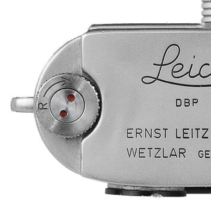
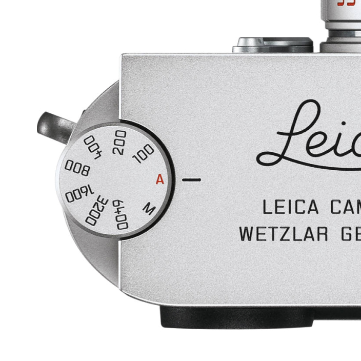
Adding a similar ISO knob to the Q would make the final part of the exposure triangle accessible physically.
Simplified UI
Much of the joy of using the Q is how little I have to use the software menus. However, there are some less-commonly used settings that I still access here and there. Later software versions in the Q introduced a useful favorites menu that is a welcome improvement over the previous system. However, the menu still relies on the list paradigm used in most of Leica’s product lines like the M and SL.

One camera broke from that altogether, the T (and later TL and TL2). Its grid-based favorites screen would be a perfect fit for the Q, given that it already has a touch screen.
Given our great spacial memory, it’s much easier to remember where an item lies in a grid than in a list. It’s why the grid-based SpringBoard concept has become the default system for smartphones.

These three changes would make the Leica Q the ultimate full-frame point and shoot.
Thanks to Q for reading drafts of this.