History
The current version of macOS descended from Mac OS X, announced at Macworld in 2000 by Steve Jobs[1]. Since then, including the Public Beta of version 10.0, there have been 17 different releases till now. The next one, version 11.0, titled Big Sur, is coming later this year.
In the intervening two decades, a lot has changed. In 2002, Steve Jobs famously dropped support for OS 9 by staging a funeral at WWDC. Macs transitioned from PowerPC to Intel chips and later to 64-bit only. Apple switched from naming releases after big cats like Panther and Jaguar to naming releases after California locations. It also renamed Mac OS X to macOS to conform better with iOS and later iPadOS.
The interface started glassy and skeuomorphic, mimicking the materials used on Macs. Over the decades, it went through significant revisions[2].
One thing that seems to have remained relatively unchanged over the years is the System Preferences screen.
But, at a closer glance, we’ll see that this mundane part of the operating system has changed quite a bit and hides some fun easter eggs and surprises.
How things have changed
Favorites bar
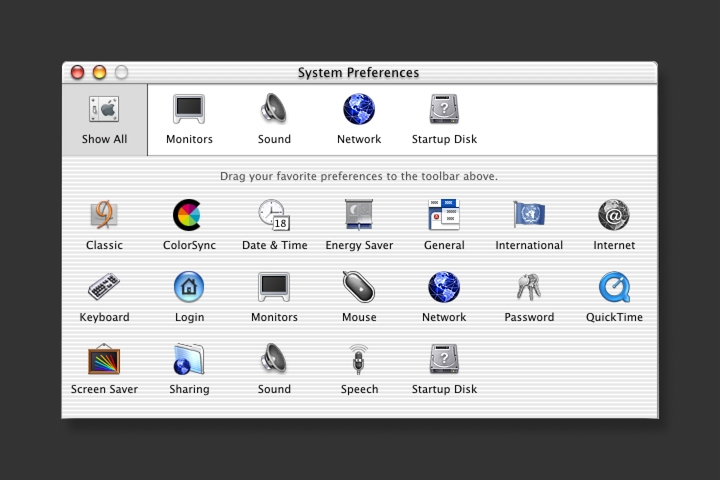
Early versions of OS X until 10.3 included a favorites bar at the top where users could drag and drop their favorite settings. In 10.4, this was removed and replaced with the search feature that highlights matching icons as you type a query.
Mouse
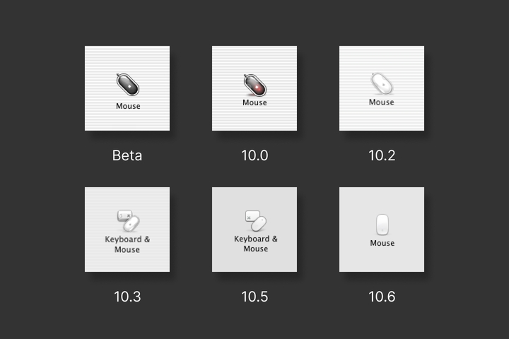
The first mouse to appear in System Preferences is the black translucent Apple Pro Mouse[3]. Between the Public Beta and the 10.0 release, an optical sensor’s red glow was added to reflect how the mouse looks when in use. Following that is the white iteration of that mouse, the short-lived Mighty Mouse, and then finally the Magic Mouse, which has undergone only minor updates till today.
Keyboard
Similarly, the keyboard icons have represented the keyboard available at the given time. In 10.0, it’s an Apple Pro Keyboard. From 10.1 to 10.5, it’s only a single command key, but then in 10.6, a full keyboard is shown again.
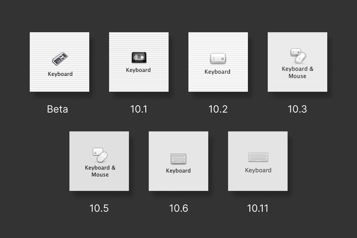
Peculiarly, in 10.3, 10.4, and 10.5, the Mouse and Keyboard settings were combined into one, but then in 10.6, they were split up again.
Displays
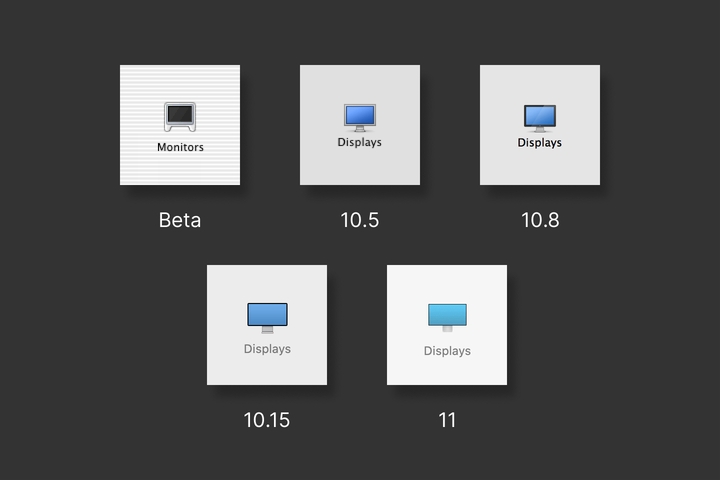
Unsurprisingly, the Displays icon has always reflected the latest Apple display starting with the transparent polycarbonate Cinema Displays until today’s Pro Display XDR. The small size allocated to the icons has meant that they usually look a little cartoonish and out of proportion, but still consistent with the rest of the icon set. However, in Big Sur, the display icon’s proportions were adjusted much closer to how Pro Display XDR looks in reality.
Print & Fax
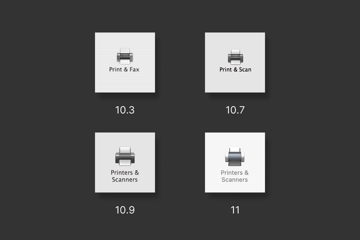
10.3 introduced the Print & Fax setting. Then in 10.7, amidst the waning use of fax machines, it was renamed Print and Scan. Finally, in 10.9, it was renamed again to the nouns Printers & Scanners to fit grammatically with everything else.
Energy Saver
In the first OS X Public Beta, a shade drawn over a window represented Energy Saver. Before release, the now recognizable light bulb took its place.
Over the years, the icon has represented the most efficient light bulb technology of the time. So, in 10.5, the icon changed from an incandescent bulb to a more efficient compact fluorescent. Then, in 10.10, the light bulb changed again to an LED design.
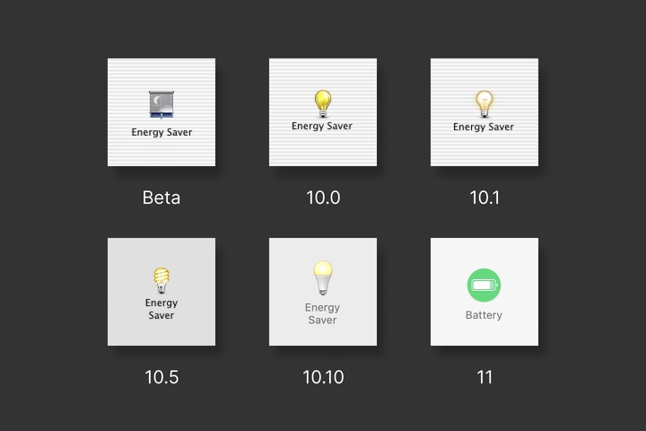
Big Sur will make away with the Energy Saver setting altogether for MacBooks (they are keeping it for desktops), replacing it with the more intuitively named”Battery setting. Oh, light bulb icon, you will be missed.
Network
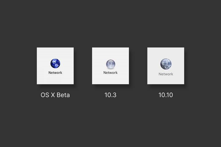
In the Public Beta, Network was a globe focused on the western hemisphere, with lines drawn as if connecting cities. Just three releases later in 10.3, that was changed over to the abstract glass ball with circular lines, a variation of which we still see today.
Date & Time
Since the Public Beta, the calendar in the icon has shown an 18. 10.10 added the month of July to the icon. July 18 likely refers to the day that the Mac OS X Public Beta was first announced at Macworld New York.
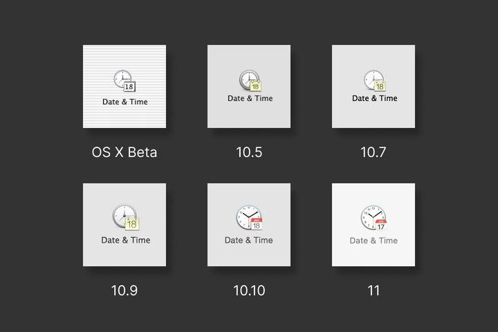
In Big Sur, after 20 years of showing July 18, that icon has changed to July 17, likely to conform with the Calendar app icon. iCal, as the Calendar app was previously known, was first shown to the public on July 17, 2002.
Language & Region
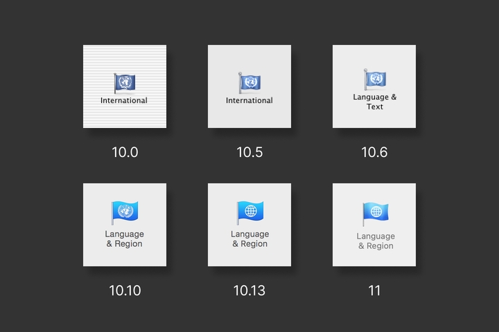
At first, this one was called International, then renamed to Language & Text and finally Language and Region. The icon was a flag bearing the logo of the United Nations. In 10.13, a banal globe icon replaced the UN logo.
Looking forward to Big Sur
Mac UI has evolved considerably, yet gradually over the last two decades. Big Sur takes this further[4] and tones down the three-dimensional aspects of the interface such as gradients, shadows, and borders.
The icons in System Preferences, on the other hand, have gone the complete opposite direction. The Sound icon now emits transparent sound waves. Screen Time is now a realistic, clear hourglass. Spotlight is now a realistic magnifying glass.
I welcome these changes and can’t wait to use them once Big Sur launches.
- Macworld San Francisco 2000 ↩︎
- On the Past, Present and Future of Apple’s Aqua User Interface · 512 Pixels ↩︎
- Apple (Pro) Mouse · Minimally Minimal ↩︎
- A visual comparison of macOS Catalina and Big Sur · Andrew Denty ↩︎
Thanks to Q for reading drafts of this. Thanks to John Gruber and John Siracusa for helping me track down the significance of July 18. Thanks to Stephen Hackett at 512 Pixels and GUIdebook for screenshots of older versions of macOS.
Update
I previously mistakenly said that Energy Saver would be replaced by the Battery setting, but I have learned that it only applies to MacBook laptops. Energy Saver will remain on desktops.